You found the pink, the purple, the soft sky blue. Then you stood at the nail bar wondering whether you actually want to announce that to your entire office on Monday. That gap between wanting to wear subtle bisexual nails and finding designs that honour both things, the pride and the privacy, is exactly what this post is for.
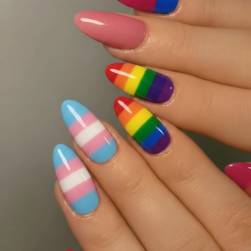
Subtle bisexual nails exist on a spectrum. At one end: a soft mauve that reads as a pretty neutral to everyone not looking for it. At the other: a pink-purple-blue French tip that anyone in the community will clock immediately. Both are valid. Both are bi. What matters is choosing where you sit on that spectrum, for any given room, on any given Tuesday.
For bolder takes on the full palette, our bisexual nails roundup covers the whole range. This post is for the quiet end. If you want broader pride inspo, pride month nails has 50+ ideas to explore.
Why Subtle Bi Nails Are a Legitimate and Beautiful Choice
Choosing a discreet manicure is not the same as hiding. You know the difference, even if the people around you don't.
Research on bisexual visibility in the workplace shows that bi people in mixed-gender relationships are often rendered invisible by default. Wearing something that only you fully understand is not a compromise. It is a form of self-knowledge. Research on bisexual workers and workplace outing shows bi employees are significantly less likely to be out to supervisors than gay and lesbian workers, not because of shame, but because selective disclosure involves real professional calculations. A nail design that lets you carry your identity without being asked to explain it is an entirely reasonable choice.
And beyond all of that: subtle bi nail art is genuinely beautiful. Pink, purple, and blue in their softer registers are among the most wearable colours in the current 2026 palette. The quiet version of bi pride looks like a manicure from a Byrdie editorial. Because it is.
The Bi Colour Palette, and How Much of It You Actually Need to Show
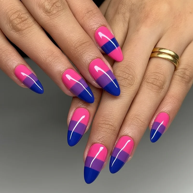
Three colours. Two ratios. One flag. That is the structural logic behind bi pride: pink and blue are the dominant colours, with purple, the overlap, sitting between them.
What this means for subtle bi pride nails is that you have more flexibility than you might think. You don't need all three shades present in equal measure. You don't need all three on every nail. One finger in each colour, or a tonal palette that leans pink-to-lavender, carries the same meaning at a much lower volume.
The bisexual flag colours, in their softened forms, are: a warm dusty pink (think ballet pink or mauve, not neon fuchsia), a medium purple in the grape-to-lavender range, and a blue that sits in periwinkle or cornflower territory rather than cobalt. All three, in these forms, are currently trending as standalone spring 2026 shades, they read as fashion-forward rather than flag-specific to anyone not already looking. The overlap between the bi colour palette and the 2026 minimalist nail aesthetic is not a coincidence. It's an opening.
The key question is not how many colours to use, but how to use them so they look intentional. The sections below answer that, design by design.
The Subtlety Spectrum: From Completely Deniable to Community-Coded
Most "subtle bisexual nails" content treats subtle as one category. It isn't. The range runs from completely mainstream to immediately community-recognisable, and knowing where a design sits helps you choose the right one for the right moment.
Fully deniable sits at one end. This is a tonal palette, all nails in soft, related shades that happen to be bi-coded: a warm blush on most fingers, a dusky lavender on one, a pale blue on another. If someone asks, it's just pretty spring colours. You know exactly what it means.
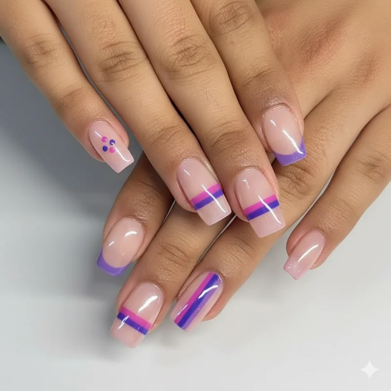
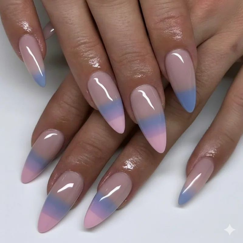
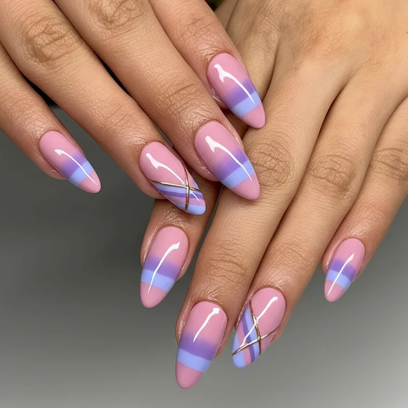
Tonal with intention is the middle zone. A French tip with a pink base and a purple tip, or a sheer gradient that moves from pink to blue. The colours are clearly related, the movement is there, but without context it reads as a curated colour-story manicure, not a statement.
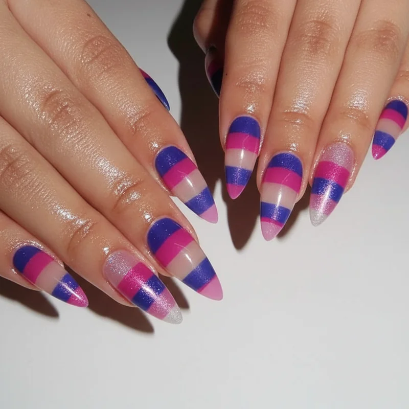
Community-coded is the far end of subtle, designs that are visually quiet but structurally specific to the bi flag. A single nail with the three colours in correct proportion. A micro-chevron in pink, purple, and blue. Anyone looking will know. Most people won't look.
Bisexual nail art inspiration from broader sources tends to cluster around the community-coded end, which is why finding subtle designs can feel so difficult. The answer is usually stepping deliberately toward the tonal end of the scale.
Discreet Bi Nail Designs for Work and Everyday Wear
Work-safe bi nails are not a compromise. They are a specific design category, and a genuinely strong one.
The approach that works best in professional settings is the tonal single-colour day. Choose one shade from the bi palette, a soft mauve, a dusty periwinkle, a barely-there blush, and wear it as a clean, glossy monochrome. This is the most plausibly deniable version of discreet bisexual nails, and also the one that gets the most compliments in neutral environments, because a well-chosen dusty lavender or soft pink looks polished rather than costumed.
For days when you want more without announcing it: two-tone, different shades on different hands. Left hand in soft pink, right hand in soft periwinkle. Most people will read this as an aesthetic choice rather than a coded one. You'll know.
For professional nail designs for work in 2026, the rule of thumb is: if the design could plausibly appear on a Byrdie editor, it works in most professional settings. Soft bi palette nails absolutely qualify. The subtle pride nails guide covers this terrain for other identities too, if you want to cross-reference what quiet pride looks like across the board.
Subtle Bi French Tip Nails: The Easiest Entry Point
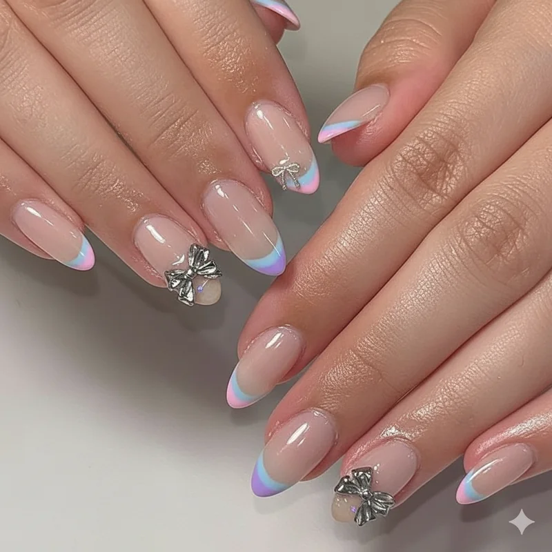
The French tip is the most efficient vehicle for subtle bi nail art. The base stays neutral, your natural nail or a sheer pink, and all the colour information sits in a thin strip at the tip. You can say a lot with very little real estate.
The simplest version: three different tips, one nail each in pink, purple, and blue, the rest in a matching neutral. The colour only appears at the edge of the finger, which means the whole hand reads as a manicure, not a flag display. Step back three feet and it looks like a soft pastel French set.
For even more subtlety: micro tips. The thinner the tip line, the more editorial and less obvious the design becomes. A 1–2mm tip in soft pink on some nails, lavender on others, periwinkle on the rest, over a sheer natural base, this is the design most likely to earn "oh I love your nails, what colour is that?" rather than "is that a pride thing?"
Colour consistency matters here. Stay in the same tonal family across all three shades. Warm dusty pink, soft warm purple, muted blue-grey. If one shade is significantly more saturated than the others, the balance breaks and the design reads louder than intended.
Bi Accent Nail Designs: Let One Finger Do the Talking
One nail. That is the entire design. The accent nail approach works because it concentrates all the meaning into a single finger, which keeps the rest of the manicure completely neutral.
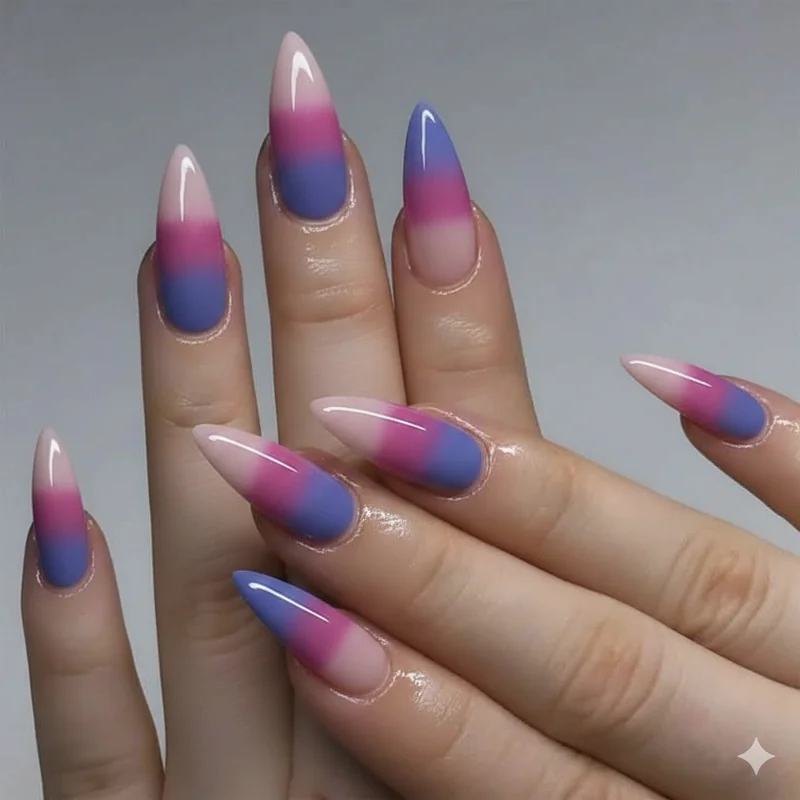
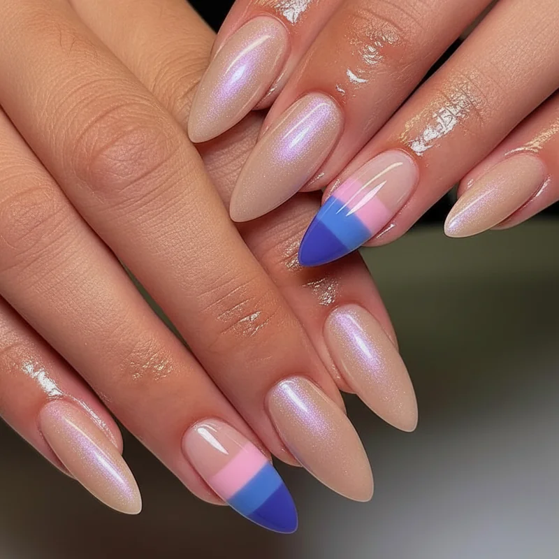
The most direct version is a ring finger, traditionally the accent nail position, painted with all three bi flag colours in clean horizontal blocks: pink at the base, purple through the centre, blue at the tip. Every other nail is a soft neutral or a single shade from the palette. The flag is there. It's just small.
A softer take: the accent nail as gradient rather than block. A gentle sponge blend from pink at the cuticle fading through lavender to a soft blue at the tip, on one finger. The blurred transition makes the three colours read as a single cohesive shade rather than three distinct bands, which pushes it toward the tonal-with-intention zone rather than the community-coded end.
Accent nails work particularly well on shorter nails because the design is contained to a small area. There's no risk of the colours fighting with each other across a full set. And placement matters, ring finger is the classic, but the middle finger creates a different visual story, slightly more deliberate, slightly more visible.
Soft Ombre and Gradient Bi Nails That Don't Scream the Flag
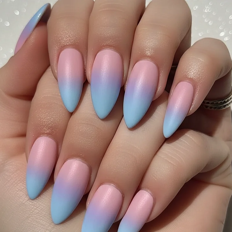
Every ombre gradient tutorial makes it look simple and every real attempt has looked like something from a first-time nail art video, which is why most people give up on gradient bi nails before they find the version that actually works at the subtle end.
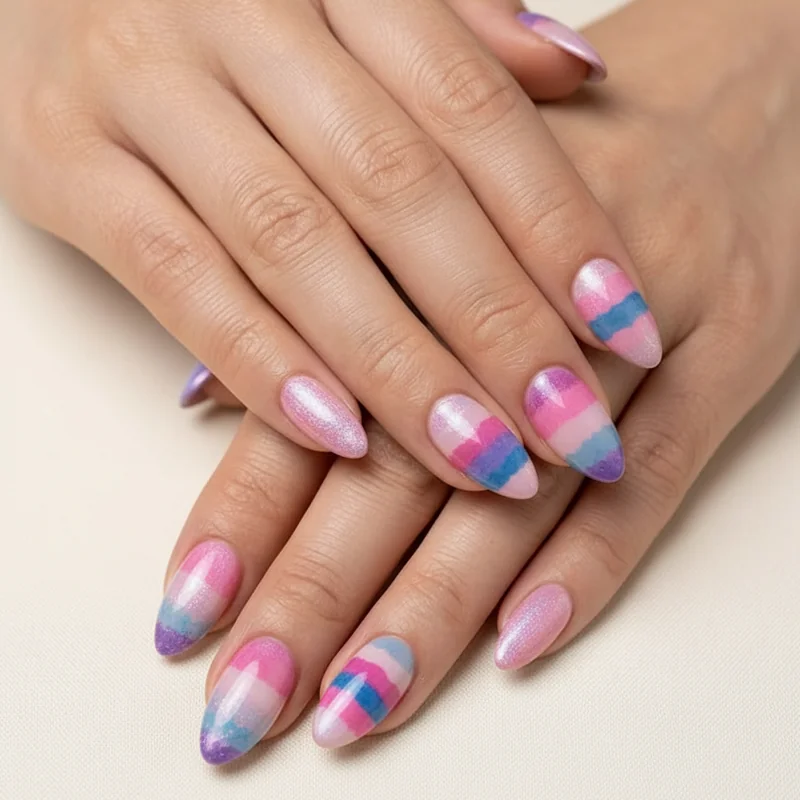
The issue is usually saturation, not technique. Highly saturated pink, purple, and blue blended together read as a clear pride flag gradient because the colours are distinct and strong. The fix is to begin with pastels, or to apply each shade sheer and build slowly. When the three colours are muted enough that their boundaries blur naturally, the finished gradient reads as a single shifting tone, something between dusky rose and soft periwinkle, rather than three separate colours side by side.
The sponge ombre technique, using a makeup sponge to stipple the transition zone, is the most accessible method for achieving this at home. Apply pink from the cuticle down, blue from the tip up, and stipple the purple in the middle third, blend while each layer is still wet. Two to three thin coats give depth without shouting. For a dedicated breakdown of the gradient approach, bi flag ombre nails covers the full technique in detail. The spring nail trends 2026 roundup shows how the muted gradient aesthetic sits within the wider 2026 minimalist manicure moment, it's not a niche look right now, it's exactly what everyone is doing.
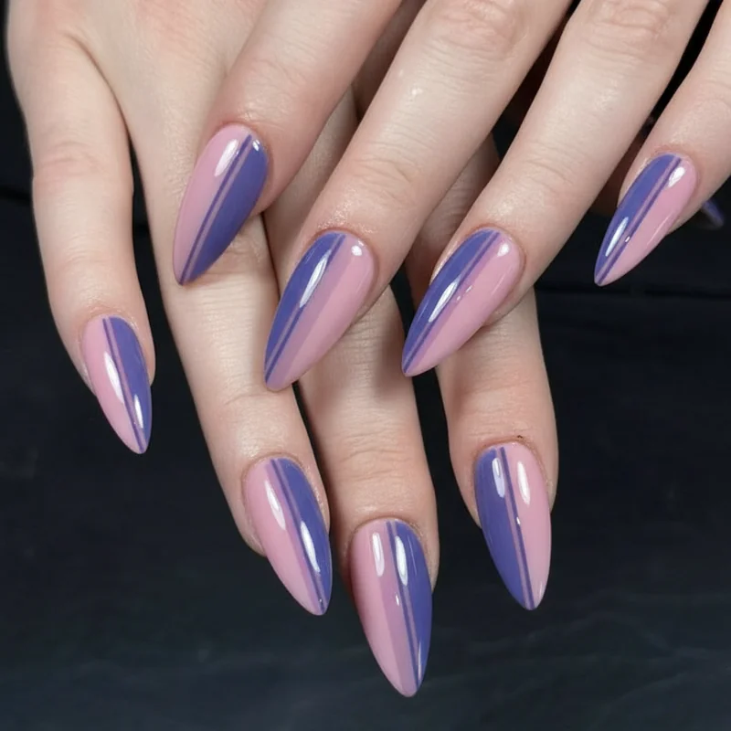
Minimalist Line Art and Negative Space for Bi Pride
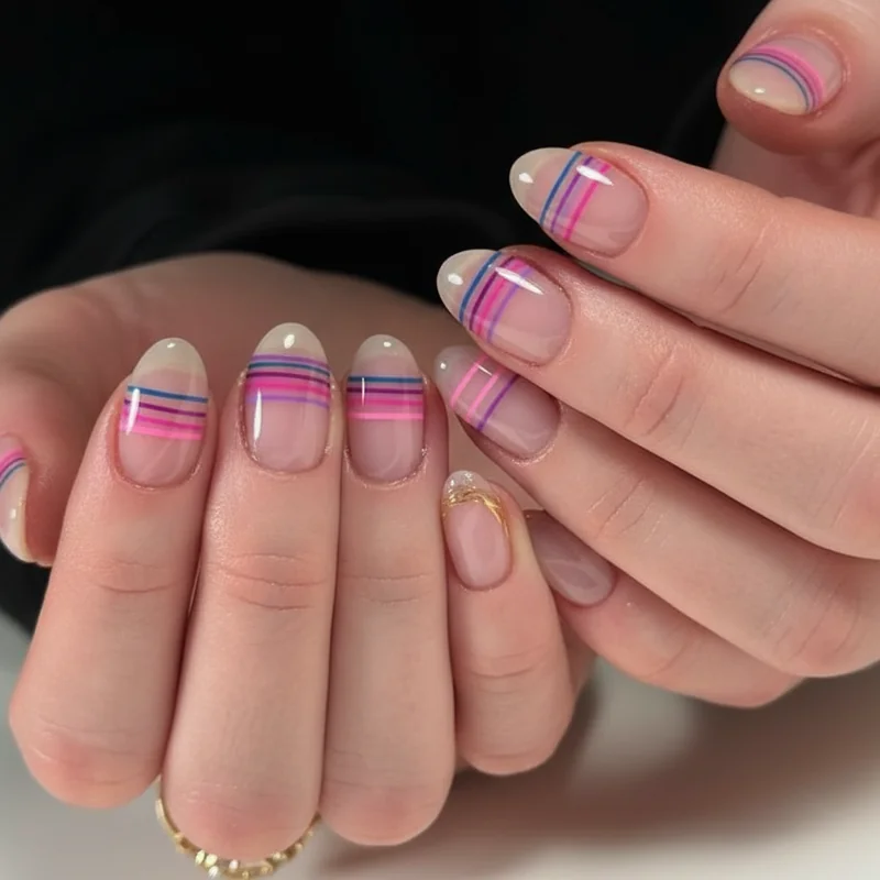
Three horizontal lines, one pink, one purple, one blue, on a bare or sheer-coated nail. That is the entire design, and it is one of the most sophisticated minimalist bisexual nail options in this category.
Negative space nail art has the useful property of looking intentionally editorial rather than specifically coded. The eye reads the bare nail as part of the design, not as an absence. This makes bi line art one of the most plausibly deniable designs in the category, the natural nail dominates, the colour is secondary, and the result looks like something you'd see in a nail art editorial rather than specifically at a pride event.
For this design to work, the lines need to be consistent: the same width, even spacing, clean edges. A thin nail art brush loaded lightly gives more control than standard brush application. Place them at the very base of the nail near the cuticle, or stacked just above the midpoint, both positions read as deliberate and minimal. Keep all other nails clear or in one sheer shade from the palette.
What Shades Actually Work for a Subtle Bi Palette
You already know the shades feel overwhelming to pin down, "pink, purple, and blue" is a range so wide it includes both bubblegum and burgundy.
For a subtle bi colour palette, the filter is warmth and saturation. You want shades that sit in the same tonal temperature and at a similar depth of colour. When all three are equally warm (or equally cool) and equally soft, they read as a coordinated palette, not a flag.
On the pink side: dusty rose, ballet pink, mauve, or soft blush. Avoid neon fuchsia and candy pink, both sit too bright to blend subtly with the other two shades. On the purple side: lavender, soft grape, or a warm dusty lilac. Mauve is a useful bridge shade that functions as both a pink and a purple depending on the light. On the blue side: periwinkle, cornflower, dusty sky blue, or a muted slate-blue. Avoid bright cobalt, navy, or royal blue, they pull too far from the warm pink to sit quietly together.
The most sophisticated combinations stay in either the warm-dusty range (mauve, warm lavender, periwinkle) or the cool-pastel range (icy pink, pale orchid, baby blue). Mixing a warm pink with a cool blue without a connecting purple creates visual tension that reads louder than either shade alone.