The search for a straight answer on work appropriate nail colors sends more professional women into a spiral than it should. One source says red is always fine. Another says never. "Just wear nude" sounds simple until you look down and realise the nude on the bottle looks nothing like a nude on your hands. The contradictions stack up, and eventually you book whatever you had last time.
What most guides miss entirely: the colour is rarely the problem. The context is. Whether a shade reads as professional nail color for work depends on your industry, your role, the meeting you are heading into, and (a variable almost no one addresses directly) your skin tone. Our full Work Nails: The Complete Guide to Office-Appropriate Manicures covers length, shape, and finish. This post is about colour specifically: what works, what is context-dependent, and how to build a decision framework that answers the question for your office, not a hypothetical one.
The Rule Behind the Rules: Why Nail Color Is About Context, Not a Colour Chart
Every contradictory piece of advice you have encountered comes from the same root problem: there is no universal professional nail colour standard. What counts as appropriate office nail color depends on your workplace culture, your role, and the specific moment you are dressing for. A BigLaw partner and a senior designer at a creative studio operate under completely different unwritten rules, and every generic approved-colour list erases that distinction entirely.
Before you pick a polish, ask two questions. What does "professional" actually mean in your specific environment? And what are the stakes of this particular day? The higher the stakes and the more conservative the culture, the further you pull toward the neutral end of the spectrum. That is not about suppressing personal style. It is reading the room, which is a professional skill in its own right. The Nails for Conservative Offices vs Creative Workplaces guide maps nail colour by industry in detail. The short version: finance, law, medicine, and government lean conservative. Tech, creative, media, and start-ups are far more permissive.
The Always-Safe Colours: Nudes, Sheers, and Milky Finishes That Work Everywhere
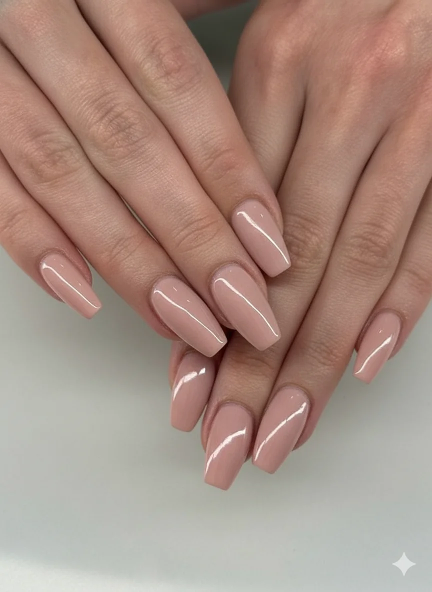
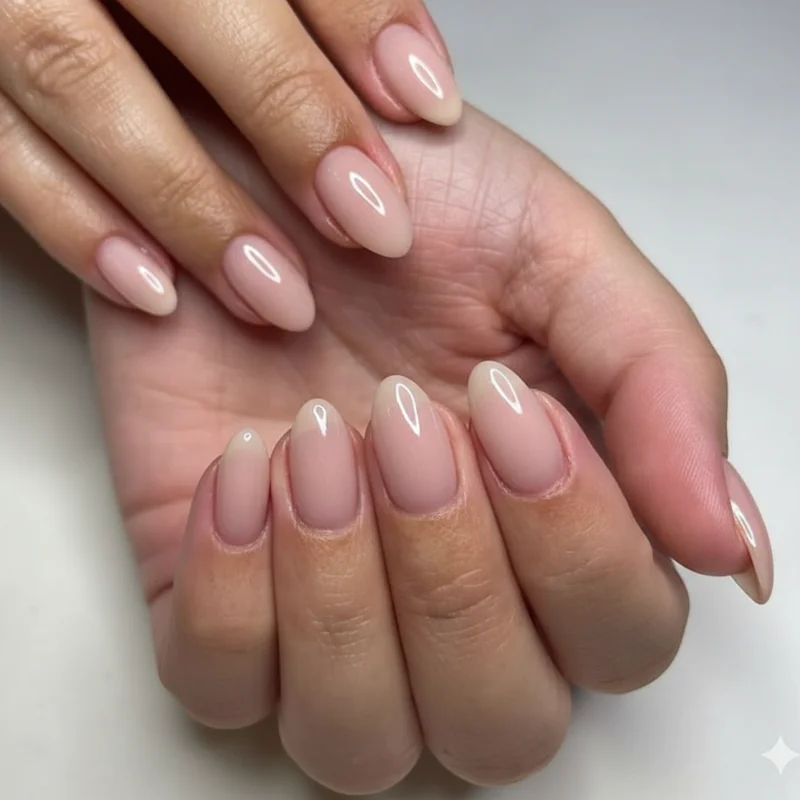
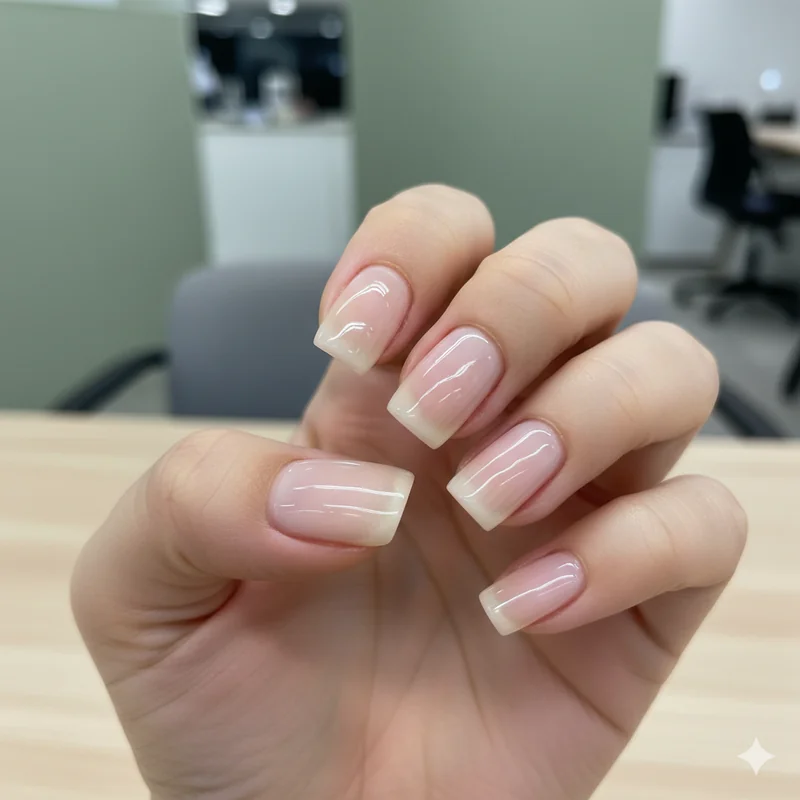
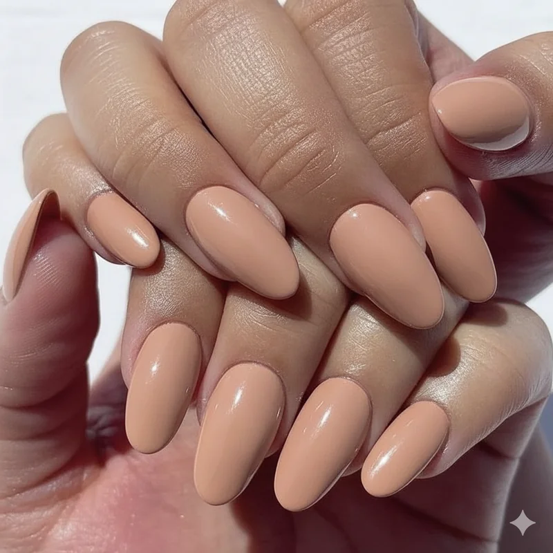
The most professional nail colour is the one nobody notices, and that is not a criticism. Nudes, sheers, and milky finishes earn their reputation precisely because they read as polished without reading as anything else. They do not compete with your outfit, they do not signal anything beyond good grooming, and they work across every industry from surgery to sales.
The category includes soft pinks, sheer beiges, milky whites, and anything with that "your nails but better" quality: a sheer formula that lets the nail bed show through with just enough colour to look intentional. OPI's Bubble Bath, Essie's Ballet Slippers, and the glazed milky finishes that have dominated 2025 and run into 2026 all sit here. For the deepest coverage within this family, a creme nude matched to your undertone gives the most polished result.
For visual references and specific shade breakdowns within this category, Neutral Nails for Work: Nude, Beige, and Milky Shades That Always Look Right is the dedicated guide. One condition applies regardless of shade: the manicure must be maintained. A chipped nude is not a safe choice. A pristine burgundy will outperform a three-week-old sheer with visible tip wear every time.
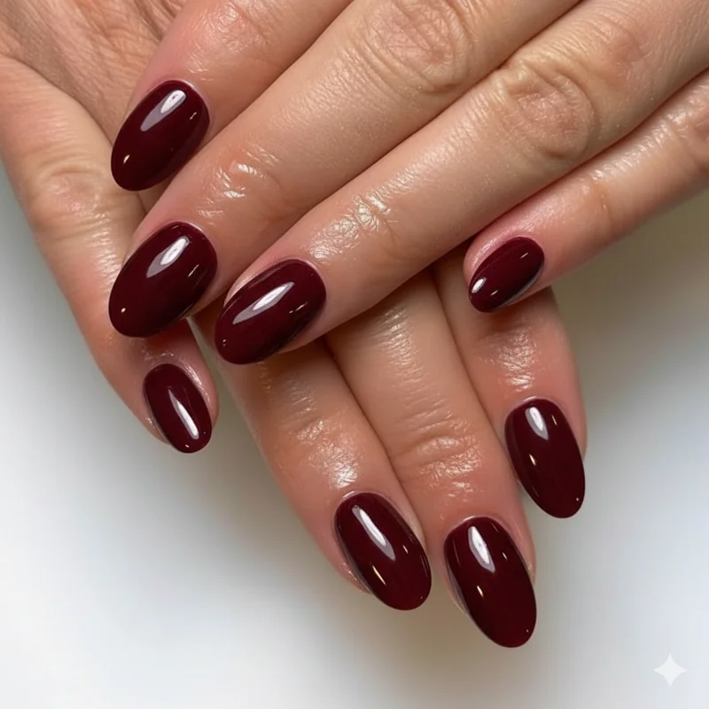
Are Red Nails Professional? The Real Answer (It's More Nuanced Than You Think)
Classic red has been worn by professional women for decades, and in many environments a clean creme red reads as confident and intentional rather than loud. But the honest answer to "are red nails appropriate for work" is: it depends on the red, the finish, and your office.
In law, finance, or medicine, a darker red or muted brick shade lands considerably better than a bright cherry or anything with an orange lean. The finish matters as much as the hue. A glossy creme red is far more acceptable than a high-shimmer or neon-adjacent version. The brighter and more pigmented the red, the more it registers as a deliberate colour statement rather than a neutral accessory. That is not a problem in a relaxed office. In a conservative one, it shifts things toward "making a point," which is rarely what you want your nails to communicate in a client meeting.
The safest professional red: go darker (burgundy, oxblood, deep berry-red), keep the finish to a creme, and apply it fresh. If you are dressing for a job interview or a high-stakes client presentation, the Nails for a Job Interview guide maps the most conservative end of appropriate in full.
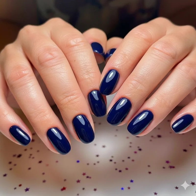
Dark Colours at Work: Burgundy, Navy, Plum When They Work and When They Don't
Dark colours are not off-limits in professional settings. They are context-dependent, which is a meaningfully different thing. Burgundy, navy, deep plum, and a well-chosen dark green occupy the "reads well in the right environment" category, and that environment is broader than most guides acknowledge.
Three things determine whether a dark shade lands professionally: finish (creme, always), condition (no chips, no visible grow-out), and office culture. Creative, tech, media, and business casual environments accommodate deep shades easily. In conservative industries, dark colours work better for internal days than client-facing ones, and they read more naturally in autumn and winter when they feel grounded rather than deliberately dramatic.
Navy deserves its own mention. It carries the same authority as navy in clothing: considered, deliberate, not trying to be noticed. For a sector-by-sector view of how professional nail colour rules shift by industry, navigating nail colour rules in 2026 covers the full landscape.
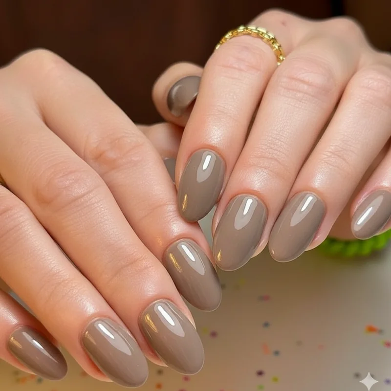
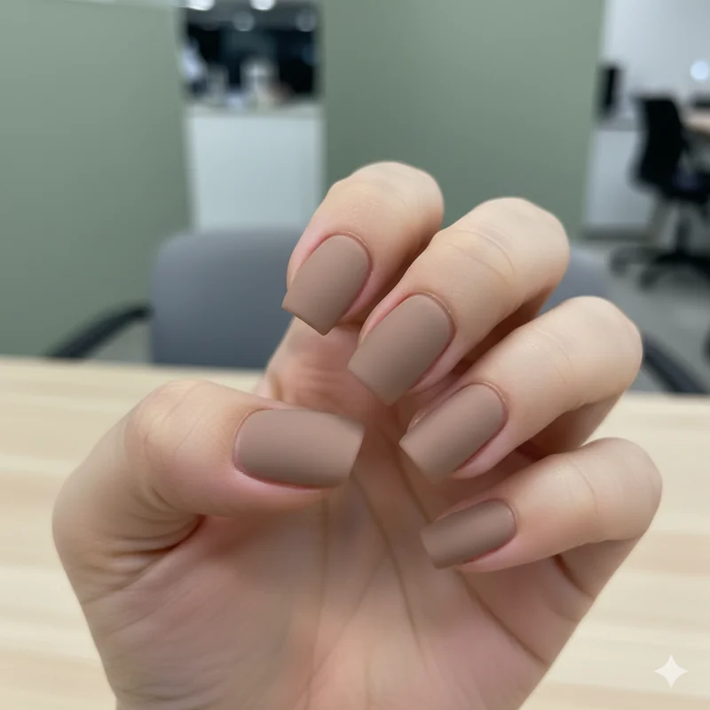
Mocha, Taupe, and Soft Grey: The 2026 Shift in What Counts as "Neutral"
The neutral category has expanded, and mocha brown is the most significant new entry. The warm, mid-tone creamy shade that dominated the 2025 Pantone cycle has moved firmly into professional territory. Once considered too bold to sit beside beige and blush, it has been adopted by C-suite wardrobes and accepted in private equity and corporate law settings for internal meetings. The critical distinction: it reads as a neutral alternative rather than a colour statement.
Is mocha brown nail polish professional in 2026? Yes, in most settings. For conservative industries, reserve it for internal days. For business casual and creative environments, it works across the board. Soft grey and greige (the grey-beige hybrids, including Essie's Chinchilly) sit in the same newly expanded neutral zone. The common thread is the quiet luxury quality these shades carry: intentional and considered, communicating taste without demanding attention.
What Nail Colours to Avoid at Work and Why
The avoidance list is shorter than most guides suggest, and the reasoning matters more than the list itself. Colours that read as unprofessional are not universally banned; they are shades whose signal-to-noise ratio is wrong for the context.
Glitter and chunky shimmer are the clearest case. In any setting, heavy glitter reads as a weekend choice that did not get changed before Monday. It draws the eye in a way that fine diffused shimmer does not. In professional environments, your nails registering should be incidental rather than compulsory. Fine shimmer within a creme formula (as in many metallic nudes) is a different matter entirely.
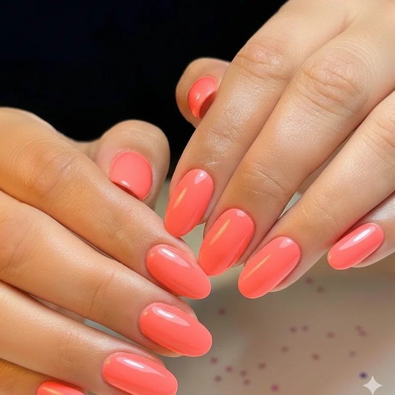
Neons and very bright brights fall out of professional range for the same reason: they demand to be noticed. A neon coral in a creative agency is very different from a neon coral in a client pitch at a financial services firm. Novelty shades, graphic nail art, multiple colours across different nails, and embellishments cross from accessory into statement in ways that distract in high-stakes moments. And chipped polish in any colour remains the most common and most easily avoided professional nail mistake.
Does Skin Tone Change What Looks Professional? (Yes, and Here's How to Use It)
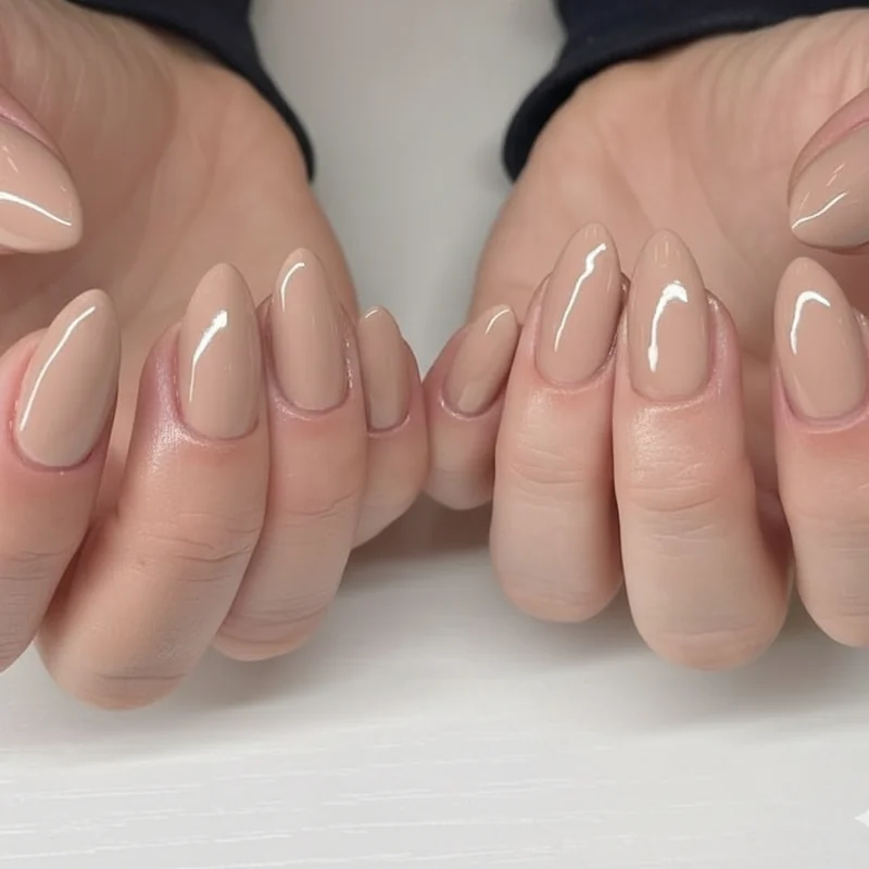
"Just wear nude" is the most frustrating piece of professional nail advice in circulation, because nude is not a colour. It is a category, and that category spans from barely-there pale pink to deep caramel depending on who is wearing it. The nude that reads as near-invisible on one person reads as a full colour statement on another. This is the variable that standard professional nail advice almost universally fails to address.
The framework that actually works: your nude should sit within one to two shades of your natural skin tone and match your undertone, not just your skin depth. Check your inner wrist veins in natural light. Blue-purple indicates cool undertones. Green-olive indicates warm. Blue-green sits neutral. Warm undertones read best in peachy beiges, warm caramel nudes, and mocha. Cool undertones read best in pink-based nudes and rosy mauves. Neutral undertones move easily across both.
For deeper skin tones specifically, the pale blush nudes dominating "professional nail" imagery create an ashy washed-out effect that is the opposite of polished. Rich caramel, mocha, and warm chocolate tones are the "your nails but better" options for deeper complexions. Deep berry and mauve read as neutrals on dark skin in the same way that pale blush reads neutral on lighter skin. For further reading on colour selection that flatters specific complexions, What Nail Polish Colors Make You Look Younger covers skin-tone-based selection in depth.
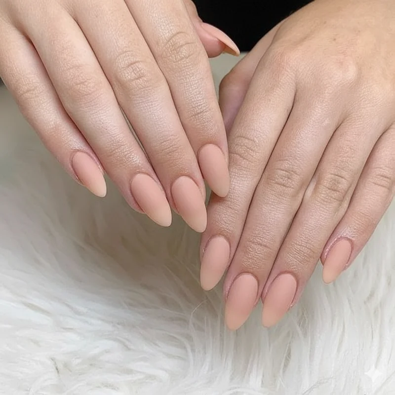
Glossy vs Matte: Does Finish Type Affect How Professional Your Nails Look?
Matte nail polish is professional. The idea that only glossy finishes read as polished is a holdover from an older era of office dress codes, and the quiet luxury aesthetic that has dominated professional dressing through 2025 and into 2026 has brought matte firmly into corporate territory. A matte taupe, matte nude, or matte soft grey reads as considered and intentional in any professional context.
Glossy finishes are slightly more forgiving: they work across a wider colour range and suit every formality level. Matte finishes are strongest in the neutral-to-dark spectrum. A matte neon or a matte glitter reads less professionally than either element would alone, and matte polish chips more visibly when it does go, which makes chip-resistant formula or gel overlay worth considering for a full working week.
Shimmer sits in the middle. Fine diffused shimmer within a neutral or muted shade, the barely-there metallic quality that reads like light catching a surface, is generally office-appropriate. Chunky glitter and high-sparkle finishes read as weekend choices in most professional settings.
Nail Colour Rules for Remote Workers and Video Calls
Remote workers get more latitude, but not unlimited latitude. On video calls, nails register differently than in person. Darker colours read heavier and more saturated on camera. What looks like a polished deep plum in person can appear almost black on a standard webcam feed. For client-facing calls, lighter muted shades photograph more cleanly and create far less visual distraction.
For internal video calls, wear whatever falls within your general professional colour range. For external or client-facing calls, treat it as you would an in-person meeting: the camera sees your hands throughout. Matte finishes in neutral tones translate particularly well to video because they avoid the reflective glare that glossy polish can produce under ring lights or desk lamps.
The honest answer to "do remote workers need to worry about nail colour on video calls?" is this: not much, but not nothing. The moment you are on camera with a client or senior stakeholder, the same contextual rules apply as they would in the room.
How to Choose Your Work Nail Colour: A Simple Decision Framework
Rather than a list to memorise, use this as a working filter before every appointment.
Step 1: Identify your office culture. Conservative (law, finance, medicine, government) or relaxed (tech, creative, media, start-ups)? Conservative culture pulls you toward neutrals and muted darks. Relaxed culture opens the full range.
Step 2: Identify the day's context. Client-facing or external meeting? Pull toward the safe end regardless of office culture. Internal day? Your culture's full range applies.
Step 3: Choose your colour family. Neutral (nude, sheer, milky, soft pink, mocha, taupe, greige) works everywhere. Muted dark (burgundy, navy, deep plum) works in relaxed cultures and internally in conservative ones. Bright or bold: only in genuinely permissive environments and not for high-stakes moments.
Step 4: Match to your skin tone. Warm undertone: peachy beige, warm brown, caramel. Cool undertone: pink nude, rosy mauve, blue-based red. Neutral undertone: works across both families.
Step 5: Check condition. Fresh and chip-free in any colour beats worn-out in any colour.
Professional women across industries consistently find that maintenance and context matter more than any specific shade. OPI's professional shade guide offers role-by-role product recommendations for those who want specific bottles. And for the question of how vibrant colours are being reframed for professional wear, the direction in 2026 is more permissive than most realise.
Your Nails, Your Office, Your Call
The most universally safe work appropriate nail colour is a well-maintained nude or sheer matched to your undertone. Everything beyond that is context. In 2026, that context is more permissive than it was five years ago: mocha brown and soft grey now sit inside the professional neutral category, matte finishes are entirely appropriate, and dark colours have earned their place in most environments with the right timing and finish.
The anxiety around nail colour at work usually comes from the sense that getting it wrong says something about your judgment. It does not. Getting it right, choosing something that fits the moment without demanding attention, is a small recurring act of professional confidence. Pick your colour, maintain it well, and move on to the things that actually matter.