Bi flag ombre nails are one of the few nail designs where the technique is the meaning. The gradient pink fading into purple, purple easing into blue doesn't just reference the bisexual pride flag; it enacts it. The purple doesn't sit between the other two colours by accident. It emerges from them. That is exactly what the flag's designer intended, and it is exactly what makes this gradient hit differently from any other three-colour blend you could choose.
This post covers the full range of bi flag gradient nails, from the soft pastel versions that work for everyday wear to bold chrome bi ombre made for Pride season. You'll find the colour order answered clearly, the three-colour blending challenge addressed honestly, and every design variation named so you can identify the one that's yours. Whether you're briefing a nail tech or DIYing it at home, this is the inspiration hub for Pride Month nails done in pink, purple, and blue.
Why Bi Flag Ombre Nails Hit Differently Than Other Pride Nail Designs
Most pride nail art references a flag. Bi flag ombre nails are one.
The bisexual pride flag was designed by Michael Page in 1998 around a specific idea: that the purple stripe doesn't simply sit between pink and blue it blends from both, just as bi people move between communities without fully belonging to either. The pink represents attraction to the same sex, the blue to the opposite sex, and the purple is the overlap. Page described the symbolism precisely: the purple pixels blend unnoticeably into both the pink and the blue, mirroring how bi people exist in the real world.
When you translate that into a gradient manicure, the design does what no stripe nail or painted flag can. The colour transition shows the logic of the flag rather than just depicting it. That is the part that makes this particular manicure feel personally meaningful in a way that goes beyond aesthetics. You're not wearing a symbol. You're wearing the symbol's actual meaning.
For readers who already know this and most will a single sentence of acknowledgement in the right place lands harder than a paragraph of explanation. This post gives it to you once, clearly, and gets on with the inspiration.
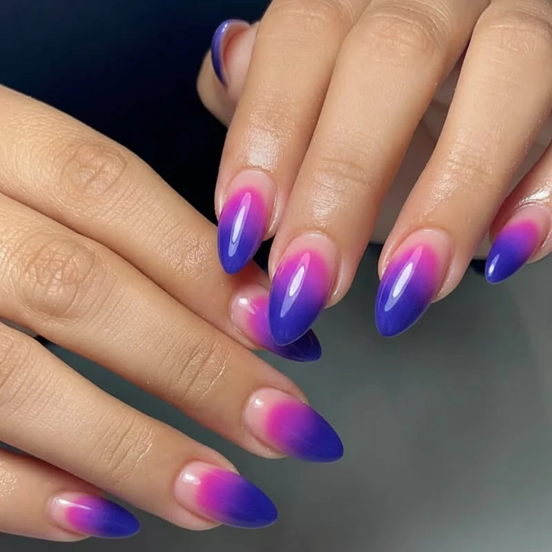
Getting the Colours Right: Pink, Purple, and Blue in the Correct Order
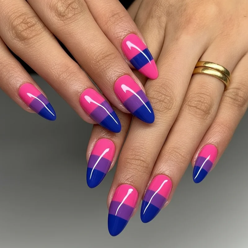
Pink at the cuticle. Purple in the middle. Blue at the tip.
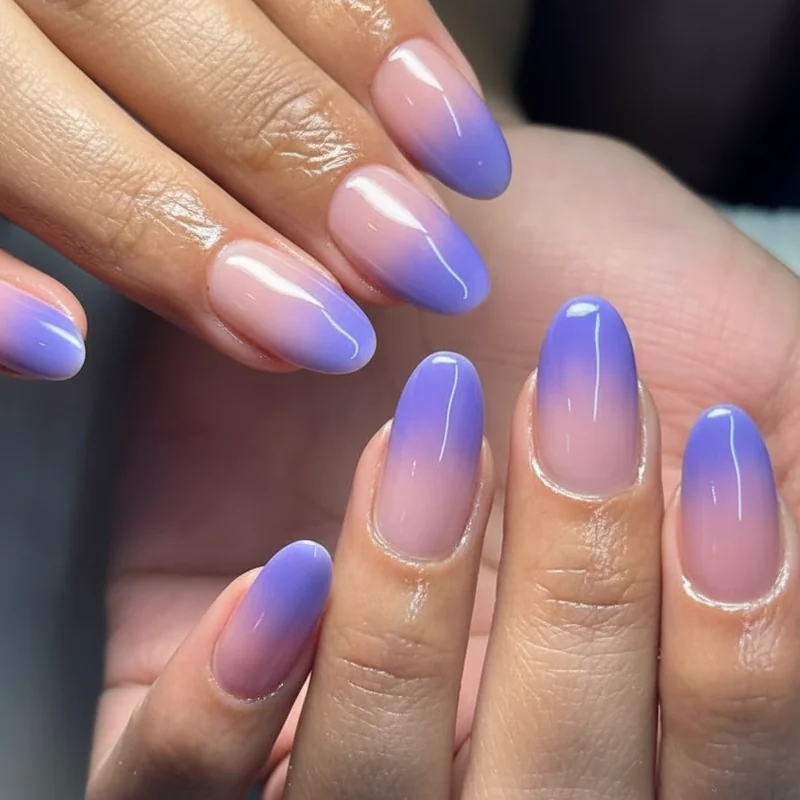
That is the answer to the question no competitor post has bothered to give clearly. The colour order mirrors the flag's stripe arrangement from top to bottom: the wider pink band sits at the base, the narrow purple band occupies the centre, and the blue anchors the tip. For a standard linear ombre, this means your sponge work starts warm and cools toward the free edge.
The proportions matter too. The bisexual pride flag follows a roughly 40/20/40 ratio pink takes up 40% of the flag, purple 20%, and blue 40%. On a nail, that translates to: the bottom third fading in from pink, the middle fifth holding the purple transition, and the upper third graduating into blue. The purple zone is intentionally narrower. If it starts taking over, the gradient loses its identity.
One note on reverse bi ombre: blue at the cuticle and pink at the tip is a valid creative choice, and some readers prefer it. It reads as the same palette just flipped. Neither version is wrong. But if you're going for flag accuracy, pink goes at the base.
Classic Bi Flag Ombre: The Sponge Gradient and Its Many Variations
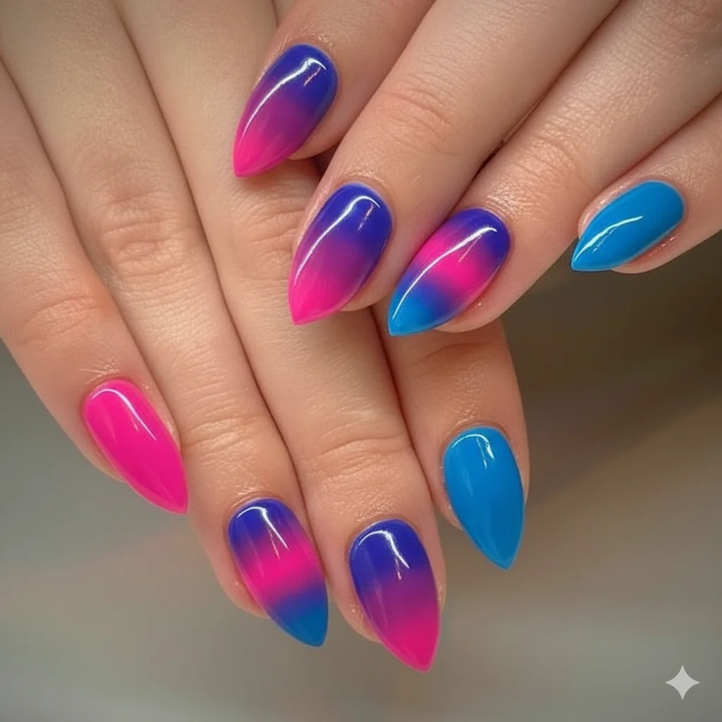
Three colours is not the same as two. That deserves saying plainly before anything else.
A standard two-colour sponge ombre say, pink to white is forgiving. The middle of the gradient takes care of itself. Add a third colour and you introduce a new problem: the purple can disappear entirely, blending into the pink and the blue and turning the middle grey or muddy. This is the most common complaint in every bi flag nail tutorial comment section, and it goes unaddressed almost everywhere.
The fix is in the layering. Rather than applying all three colours to the sponge at once, work in passes. Apply pink to the lower third of a makeup sponge and stipple it onto the nail first. Let it dry slightly. Apply purple to the middle of the sponge and stipple it so it overlaps both the pink layer and bare nail above it. Then add the blue to the upper portion and stipple downward into the purple zone not past it. The purple stays visible because it gets its own dedicated layer rather than being squeezed between two heavier pigments.
For a full DIY walkthrough, the step-by-step at-home pride nail guide covers the exact technique. The sponge ombre also works in a French fade format bi colours at the tip blending into a sheer or nude base and as a single accent nail within a neutral set. You don't have to do all ten fingers. One gradient nail surrounded by a bare or glazed set is a completely valid interpretation. For the sponge-to-gel crossover, the principles in this gel ombre technique guide apply directly to the layering structure.
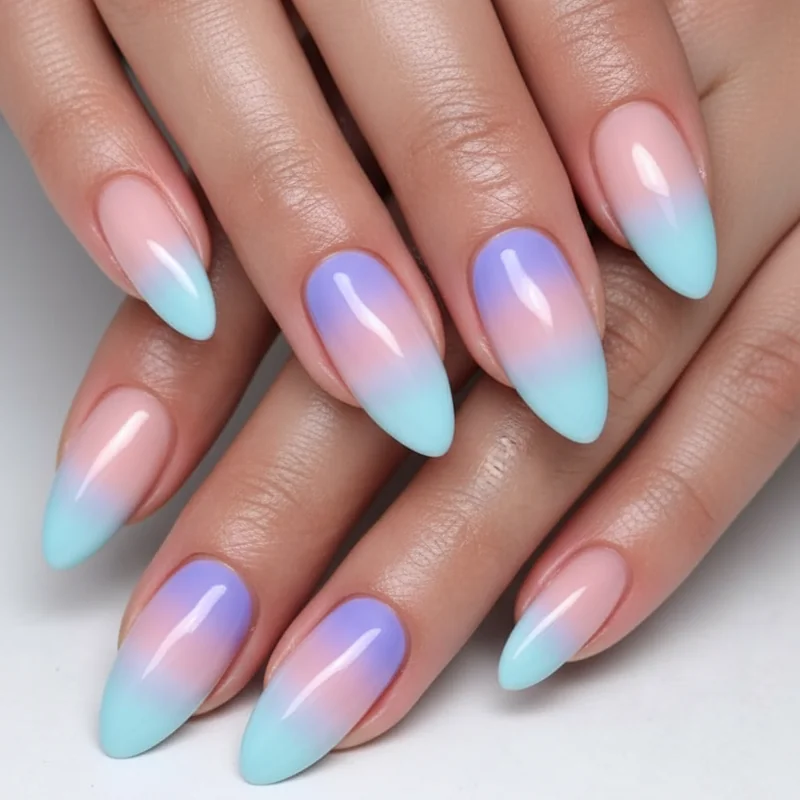
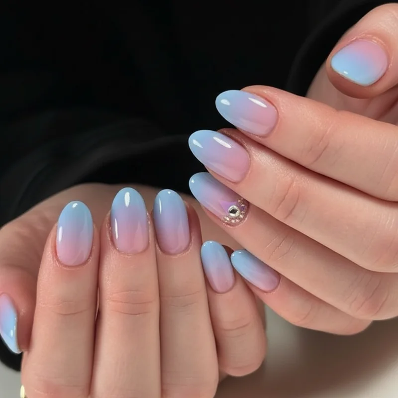
Soft and Pastel: Bi Flag Ombre Nails for Everyday Wear
Not every bi flag manicure needs to announce itself across a room.
The pastel version soft rose fading into lavender fading into periwinkle reads as a delicate colour gradient first, a pride statement second. It works in a professional setting, on a first date, or in any context where the full bold version might feel like more than you want to carry that day. The identity is still present. It just speaks quietly.
Colour choices matter here. For pastel bi ombre, reach for a dusty rose rather than a hot pink, a soft lilac rather than a saturated purple, and a hazy blue-grey rather than a cobalt. The transitions between them are smoother at lower saturation which also means the three-colour blending challenge is more manageable. Muddy middles happen most with bold, heavily pigmented polishes. Pastels are naturally more transparent and blend with less resistance.
A single coat of each colour over a white or sheer base will lift the soft tones and keep the gradient readable. Two coats risks going opaque, and opacity collapses the fade. The pastel bi ombre also photographs beautifully in natural light the hazy gradient picks up warmth in a way that saturated polish doesn't.
Readers wanting more understated options a single accent nail, a barely-visible indoor gradient will find those in the subtle bisexual nails guide. Pastel bi ombre sits between the two: present without being loud, visible without demanding attention.
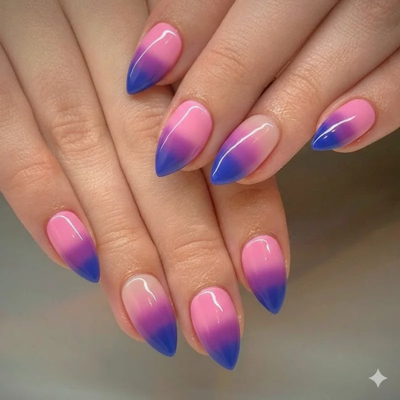
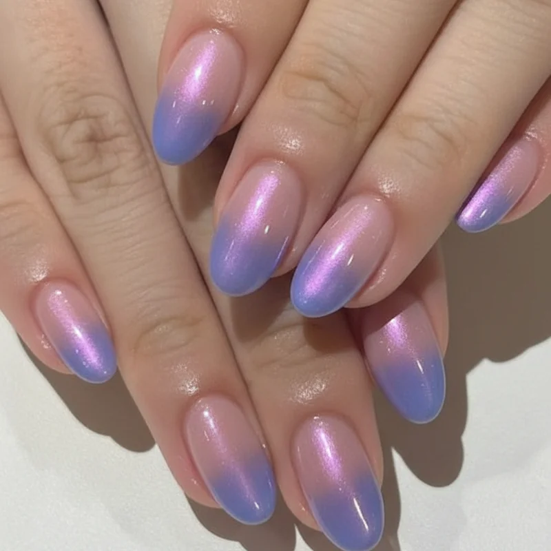
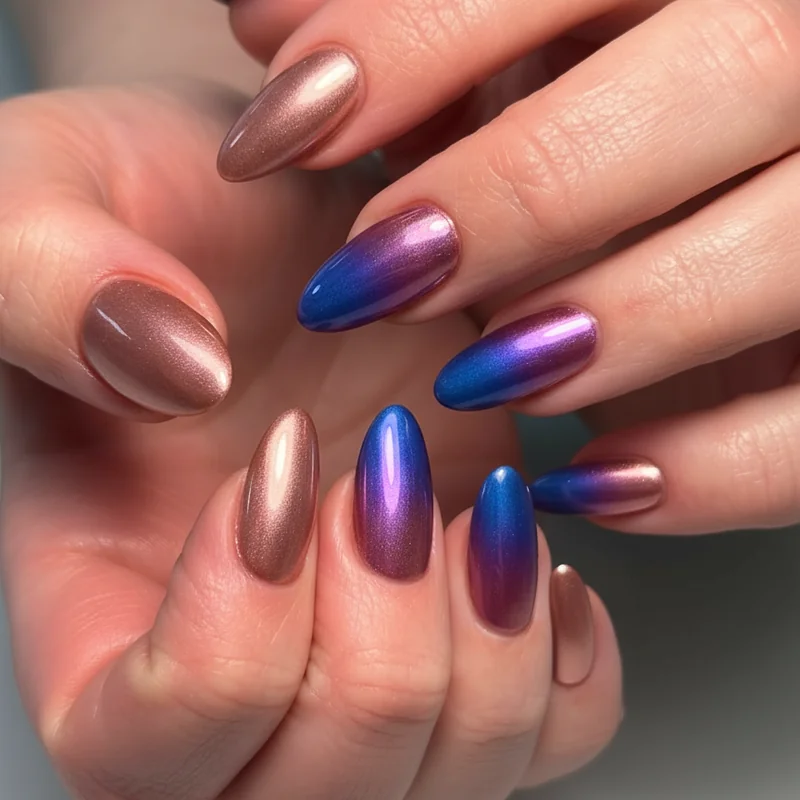
Bold and Chrome: Elevated Bi Flag Ombre Designs for 2026
Chrome bi ombre is the version that earns saves.
The technique applies chrome powder separately in pink, purple, and blue over a cured gel base, building each metallic zone the same way a sponge ombre builds each colour zone. The result is a mirror-finish gradient: the nail shifts from rose gold chrome at the cuticle through a violet chrome centre into a cobalt chrome tip. It catches the light differently at every angle, and the colour depth is a level above anything achievable with standard polish.
For the full pigment powder approach used by professional nail artists, this abstract bisexual flag nail tutorial by a Washington-based LGBTQ+ nail artist covers the technique with blue and purple pigment powders over a gel base worth showing your tech directly if you want that specific finish.
Two other bold variations are worth naming for 2026. Neon bi ombre hot pink, electric purple, vivid blue for Pride events where the gradient should read from across a room. And glitter bi ombre, where a fine iridescent glitter is stippled over the transition zones to diffuse the blends and add dimension. Both perform best in salon conditions with gel. For a longer-wearing alternative, spring acrylic nail sets include ombre almond acrylics that translate directly to the bi colour palette and last the full season.
Bi Aura Nails vs. Bi Ombre Nails What's the Difference and Which Should You Choose?
They use the same three colours. They are not the same design.
Bi ombre nails create a linear gradient colour transitions from the cuticle to the tip in a straight horizontal band. Bi aura nails create a radial gradient colour radiates outward from a central point, typically the middle of the nail, like a soft atmospheric glow. On aura nails, the purple usually sits at the centre and the pink and blue appear at the edges. The overall effect is softer and more diffuse: less structured stripe, more colour atmosphere.
The technique differs too. Aura nails are typically built with a gel brush, applying colour in thin, feathered strokes from the centre outward, blending the edges before curing. You can also create the aura effect by stippling dark purple or vivid blue at the nail edges and fading inward toward a lighter centre. For a detailed look at the aura technique applied to a similar palette, the Valentine's Day 2026 nail trends post covers aura nails in depth the method transfers directly to bi colours.
Which should you choose? Bi ombre is more literal it maps to the flag's structure. Bi aura is more impressionistic it evokes the palette without committing to the stripe. If you want something that reads as explicitly bi flag, go ombre. If you want something that carries the colours in a more painterly, less structured way, go aura. Both are worth knowing by name so you can search for exactly what you're looking for.
Which Nail Shape Shows Bi Flag Ombre Best?
Almond, without much competition.
The tapered tip naturally elongates the gradient there's more vertical length for the three colour zones to breathe, and the narrowing toward the tip gives the blue zone a pointed finish that looks deliberate rather than blunt. A well-executed bi ombre on almond nails is the version that earns the most saves. For shape-specific inspiration, bisexual nails almond shape covers the full range of pink, purple, and blue designs suited to almond length and finish.
Coffin nails are the second-best canvas. The flat tip gives the blue zone a clean horizontal edge, and the wider nail bed offers more surface area for the gradient to develop across. Long coffin bi ombre tends toward the bold and graphic. If you want a manicure that commands attention, coffin in chrome bi colours is the place to start.
Stiletto nails read more editorial the extreme taper makes each colour zone narrow, so the gradient becomes almost impressionistic. It works, but it's not the most legible version of the design.
Square and squoval nails sit at the more everyday end. The gradient reads cleanly, the transition is visible, and the overall look is accessible rather than maximalist. Shorter square bi ombre is also the most forgiving shape for a first attempt at the three-colour technique less surface area to manage, more room for error at the blending stage.