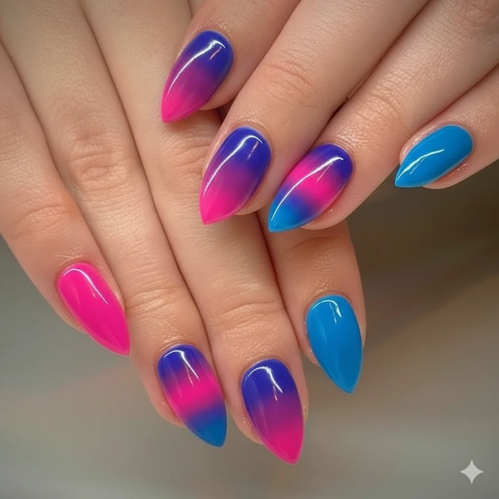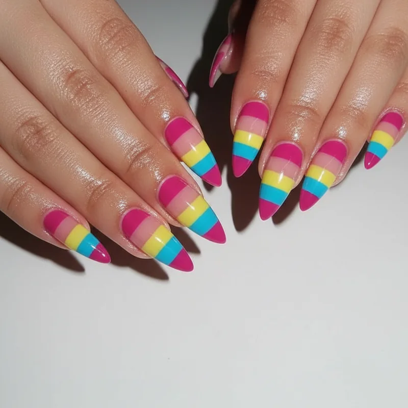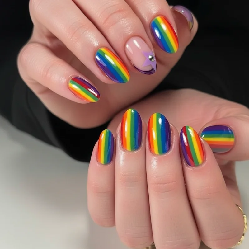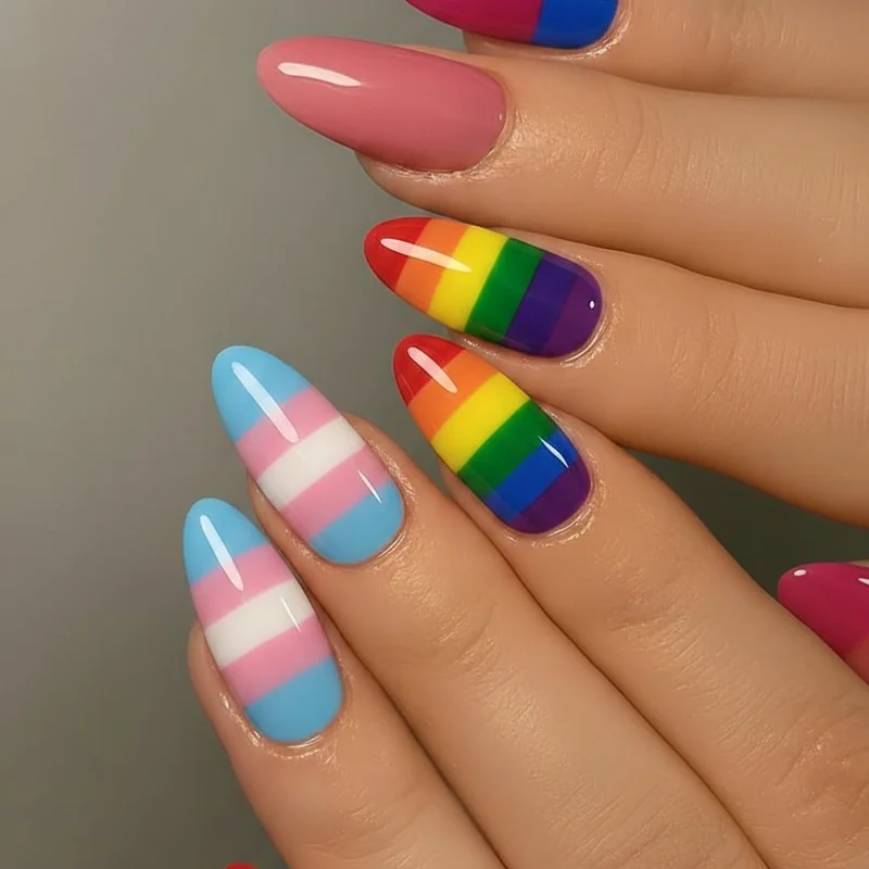
Gemini nails are not about indecision. They are about having the range — and wearing it all at once.
If your birthday falls between May 21 and June 20, or if you have simply never been able to choose just one polish colour at the salon, this post was built for you. Gemini nail designs in 2026 have moved well past the "two colours because twins" shorthand. The best ones use contrast as a deliberate design principle: two tones that tension against each other in a way that feels edited, not accidental. Below, you will find ten sections covering everything from the full Gemini colour palette to the butterfly debate, short nail options, skin tone guidance, and exactly what to say to your nail tech. If you want to understand how Gemini nail art fits into the wider world of zodiac nails and sign-based manicure design, that guide is the place to start.
What Makes a Nail Design Truly Gemini?
Most nail content answers this question with "two colours, because twins." That is the start of the answer, not the whole of it.
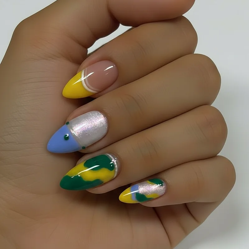
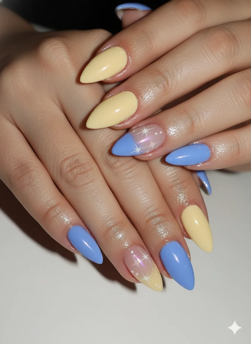
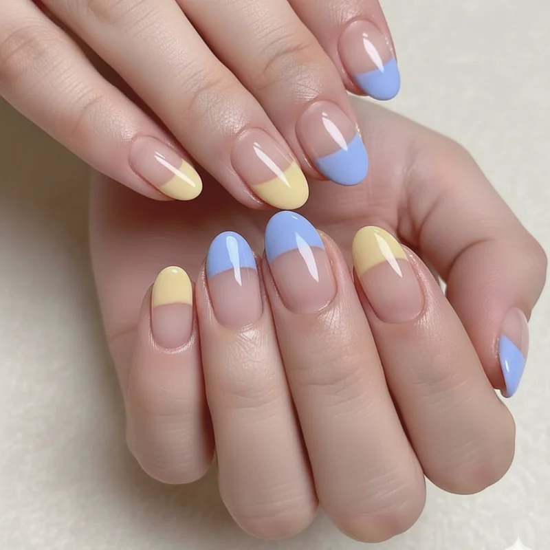
What are gemini nails at their core? They are manicures built around contrast as a design principle. The twins of the Gemini symbol — Castor and Pollux — represent two distinct energies held in one person: curious and restless, social and cerebral, light and dark. A nail design earns the Gemini label when it captures that productive tension, not just when it uses two shades. A split French tip where one half is butter yellow and the other is periwinkle: that is Gemini. A skittle set that cycles through warm and cool in alternating nails: that is Gemini. A single chrome accent nail on an otherwise pearl-white set, creating one moment of intensity in something soft: that is Gemini too.
The design question is not "what two colours?" It is "what two energies?" Once you frame it that way, the design choices become much more interesting — and much more personal. For the full picture of how each sign translates its personality into nail art, the zodiac nails guide goes deep on every sign in the calendar.
The Gemini Colour Palette: Yellow, Periwinkle, Pearl, and the Rest
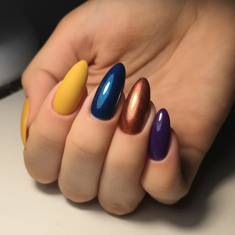
The Gemini colour toolkit is one of the most interesting in the zodiac — and most nail content uses only half of it.
Butter yellow is the signature. It is Gemini's aura colour, Mercury's brightness made wearable, and it photographs beautifully across skin tones. Not sharp lemon, not neon — the best Gemini yellow sits somewhere warm and luminous, like afternoon light. Professional sources including The Gel Bottle's zodiac colour guide consistently cite yellow as Gemini's spirit colour, and the aura nail trend has given it new life as a sponged or airbrushed gradient rather than a flat application.
Periwinkle is the natural contrast partner — cool where yellow is warm, calm where yellow is bright. The two together have just enough tension to feel intentional without clashing.
Then there are the birthstones — and this is where most competitors stop short. Gemini actually has two birthstones, because of course it does. May Geminis claim emerald: a deep, saturated green that pairs beautifully with gold foil or a cream base. June Geminis claim pearl: that soft, iridescent milky tone that currently dominates minimalist nail content. The full picture of Gemini birthstones — pearl and emerald gives the palette its full range. Used together, they make an extraordinary two-tone set: pearl on one hand, emerald on the other.
Rounding out the palette: soft gold, mint, and a washed-out sky blue that reads as the air sign version of navy. These are your supporting players — strong on accent nails, excellent in skittle sets.
Dual-Tone and Split Designs: How to Make Contrast Look Intentional
Two colours that look like a mistake versus two colours that look like a decision. The difference is smaller than you think.
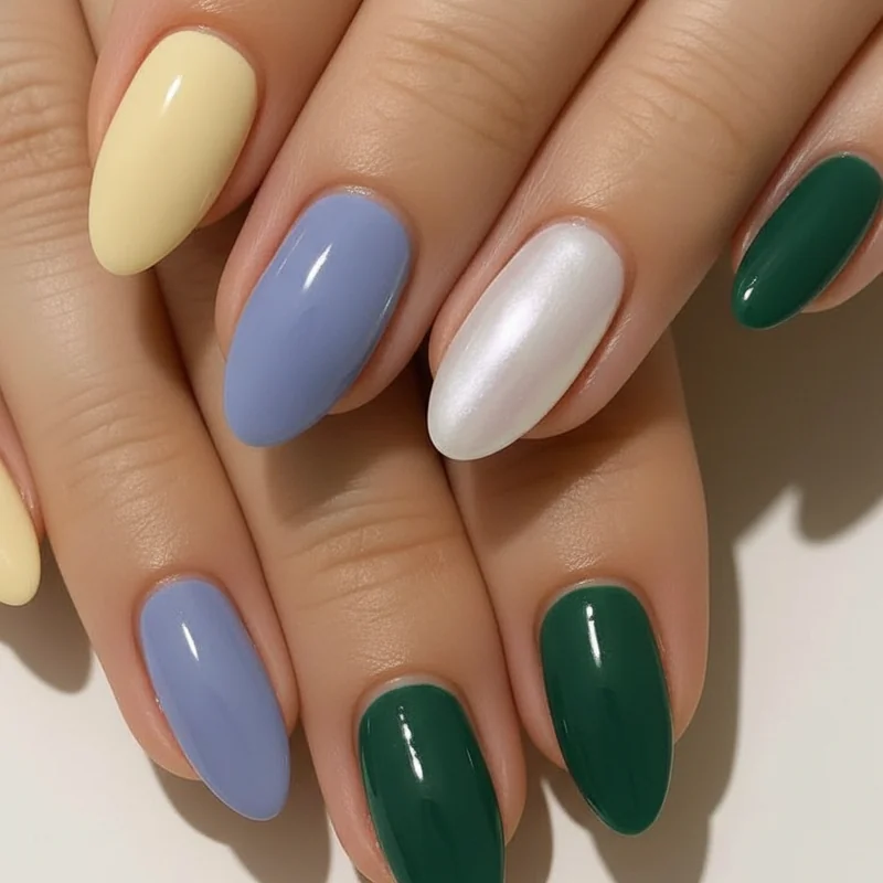
Cohesion in a dual-tone nail set comes from one of three things: shared temperature (both warm, or both cool), shared value (both pastels, or both saturated), or a repeated finish that runs through the whole set. Choose two colours that break all three of those rules and the set will look chaotic. Follow even one of them and the contrast reads as intentional. Butter yellow and periwinkle share a similar mid-saturation value — neither is washed out, neither is neon — which is exactly why they work so well together in the dual-tone designs dominating summer nail trends this year.
The split French tip is the most wearable entry point for gemini nail art. One side of the tip in yellow, the other in periwinkle, separated at the smile line. It reads as sophisticated at a distance and reveals its detail up close. For something bolder: one full hand in colour A, the other in colour B. Mirroring the design on each hand — same motif, different colour — is the approach nail artist Leighton recommends in his nail artist perspective on Gemini nails for Country and Town House: the design stays consistent, the colour does the duality work.
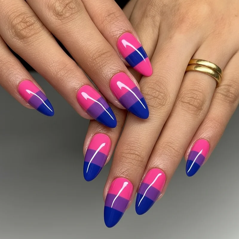
Colour-blocked sets — alternating nails between two shades in the same set — work best when the two shades are clearly distinct. Pale yellow and white are too similar to read as intentional contrast. Butter yellow and deep periwinkle: clear. Emerald and pearl: clear.
Gemini Birthday Nails: Statement Sets for May and June Celebrations
Birthday nails deserve more than a generic glitter set. Here is how to make them actually feel like yours.
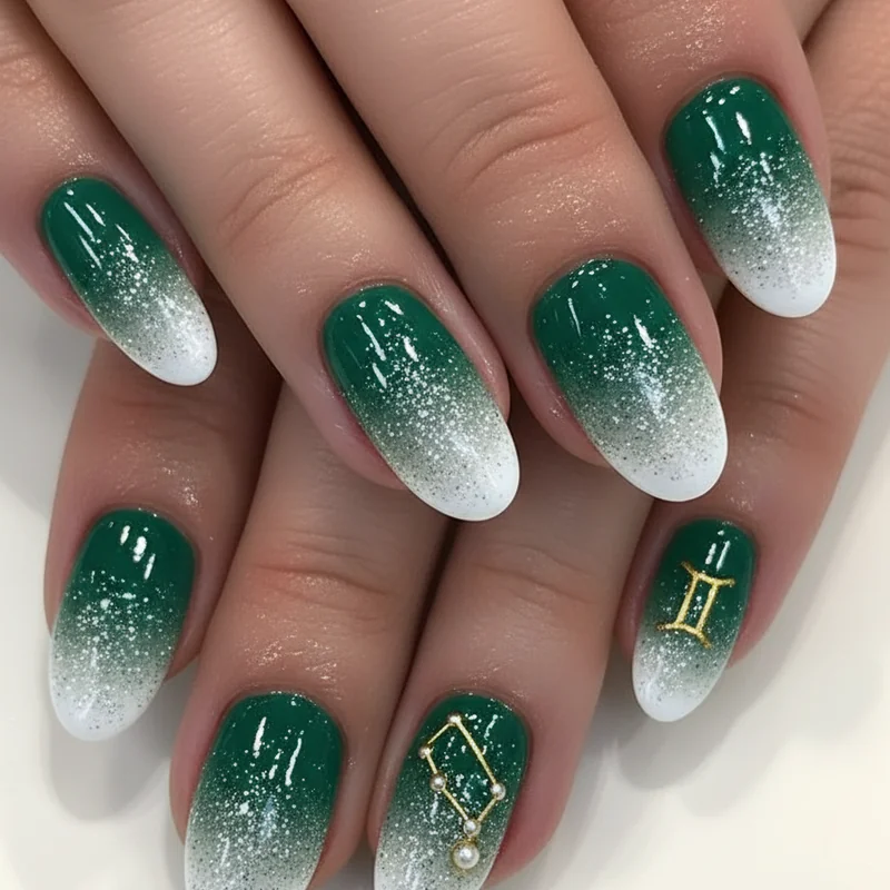
May Geminis have emerald in their corner. A deep emerald base with a thin gold foil wrap on one accent nail — the II symbol painted in fine-line gold on the ring finger — is a birthday set that photographs beautifully and reads as astrologically specific without announcing itself loudly. Emerald also happens to flatter a wide range of skin tones, which makes it a stronger birthday choice than the lighter pastels.
June Geminis get pearl. A pearl-white jelly finish is one of the most quietly beautiful options in the nail canon right now — luminous, soft, glass-like when layered correctly. Paired with a constellation accent on the index finger (the Gemini constellation is simple enough to execute with a fine nail art brush and some gold gel) it becomes a genuine birthday set rather than just a pretty manicure.
Both months: butter yellow aura nails remain the most popular Gemini birthday choice because yellow genuinely reads as celebratory without needing additional embellishment. A warm sponge gradient in butter yellow over a nude base, with a single chrome nail for punctuation. The solar return nail look.
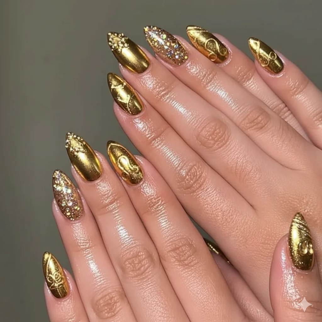
The II symbol — Gemini's actual zodiac glyph — is a design element that competitors consistently include as a photograph and never explain. It is two vertical parallel lines with horizontal bars at the top and bottom. On a nail, it is cleanest rendered in fine-line gel or chrome powder over a contrasting base: gold II on deep emerald, silver II on pearl white, black II on butter yellow.
The Butterfly Question: Still Fresh, or Time to Move On?
The honest answer: butterflies are still earning their place in 2026, but only when they are doing something more than appearing.
The frustration is real. If you have searched "gemini nail art" recently, you have seen butterflies on approximately forty percent of the results. The saturation is high. But the motif itself has not run out of logic — Gemini is genuinely the social butterfly of the zodiac, an air sign associated with lightness, transformation, and constant movement. The connection is not arbitrary. The problem is execution: most butterfly Gemini nails are simply butterfly nails with a yellow or blue polish, not butterfly nails designed with Gemini's dual nature in mind.
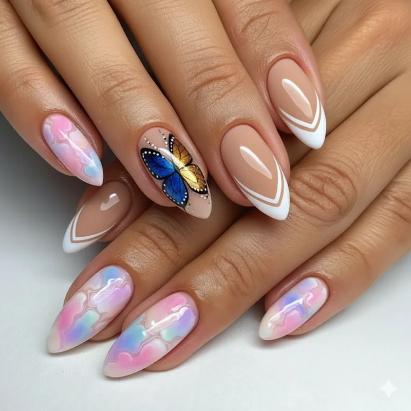
A butterfly rendered in split colours — one wing in butter yellow gel, the other in periwinkle — is doing design work that earns its place. A butterfly silhouette used in negative space on a chrome nail is editorial. A full 3D butterfly on a standard square nail in one colour is just a butterfly nail.
If you want to move entirely past the butterfly, the strongest alternatives are: the II symbol (distinct and specific to Gemini, explained above), blooming gel designs in two colours (the technique produces cloud-like formations that expand as the gel sets — two-colour blooming nails are one of the most Gemini-appropriate techniques available), and floral abstraction, which sits adjacent to butterfly energy without being the same. Spring floral nail art is particularly strong as a Gemini season alternative — botanical and airy, carrying the same lightness as the butterfly motif with none of the oversaturation.
Gemini Nails for Short Nails: Designs That Actually Work at Any Length
Short Geminis exist, and most nail content does not accommodate them. This section does.
The styling reality of most Gemini nail inspo is long stiletto or coffin nails on a light background, photographed in high contrast. If your nails are short and square or short and oval, the designs can feel inaccessible. They are not — they just need to be approached differently. On a shorter nail bed, the design needs visible contrast to read clearly. Subtlety gets lost. This is actually good news for dual-tone nails: contrast is already built in.
The split French tip works beautifully on short lengths — possibly better than on long nails, because the tip is proportionally more prominent on a short square nail. Two-tone colour blocking (alternating nails, two colours) reads crisply regardless of length. Jelly finishes — a sheer, glass-like polish with buildable opacity — are particularly strong on shorter nails because the translucency adds the impression of depth without requiring surface space. Short summer nail designs covers this format in more depth if you want to go further.
Negative space designs are another strong short-nail option: a periwinkle base with an unpainted crescent at the cuticle, or a yellow tip leaving the lower nail bare. The negative space creates a dual element without requiring two colours at all.
Can gemini nails work on short nails? Absolutely. Avoid designs that rely on length for their visual logic — long linear gradients, elaborate 3D embellishments — and choose designs whose duality is visible at a thumbnail scale.
Soft and Minimal Gemini Nails for When You Want the Vibe Without the Drama
Duality does not have to be loud. The most refined Gemini nail sets are the ones that whisper it.
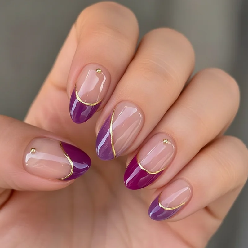
A pearl-white base with a single soft gold II symbol on the ring finger: Gemini. A periwinkle jelly finish with a chrome accent nail in a cooler silver: air sign energy, quiet. A two-tone set in the palest possible butter yellow and the faintest mint, the contrast so gentle you almost miss it until you look closely: still Gemini, still intentional.
Minimal Gemini nails appeal specifically to the reader who loves astrology as personal resonance rather than maximal self-expression. If your birth chart leans toward a more introverted or airy placement, the soft interpretation will feel more authentic than a neon skittle set. Astrology nails and what your birth chart says about your manicure goes into this translation in detail — it is worth reading if you want to understand why certain design energies feel more "you" than others.
The aura gradient works softly too. A pale butter yellow aura on a sheer base, blended at the edges until it reads more as a glow than a colour, topped with a high-gloss coat. On short or long nails, it feels elevated rather than themed. Add a single chrome nail — or don't. The restraint is the point.
Bold Gemini Nails: Maximum Dual Energy for the Sign That Wants It All
Some Gemini sets are not trying to be subtle. Good.
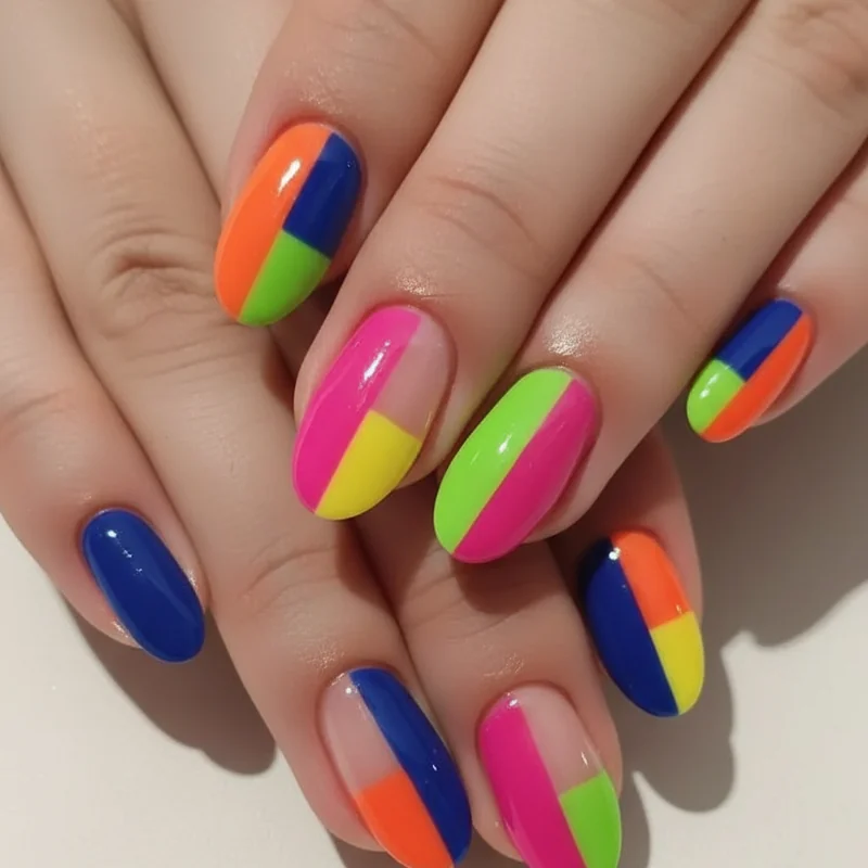
The neon two-tone: one hand in vivid yellow gel, the other in electric periwinkle, both in a glossy jelly finish so they read as saturated without being flat. The contrast across both hands is the entire design. No motif needed, no embellishment — just two colours owned completely. This is the maximum expression of dual-tone Gemini nail art and it requires confidence to wear, which is entirely appropriate for the sign.
The skittle set at full intensity: five nails, five colours, all from the Gemini palette — butter yellow, periwinkle, emerald, pearl, and soft gold. One colour per nail, no repeats, all in the same finish (all gel, all gloss) so the set feels unified despite the variety. This is the "I genuinely could not pick just one colour" answer made into a design decision.
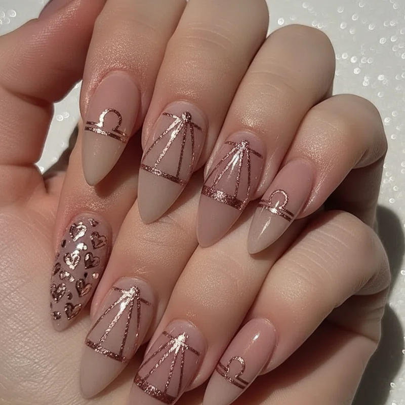
Mismatched hand designs — one hand geometric, the other floral; one hand aura gradient, the other flat colour — are strong here too. The logic is the same as the II symbol: two things held together that are distinct but related. Fellow air sign Libra approaches bold contrast through balance and symmetry, and Aquarius pushes it into graphic and futuristic territory — but Gemini's version is the most playful of the three. The bold set that looks like a decision, not an accident.