Yellowstone Nails: Geyser Gold and Steamy Blues
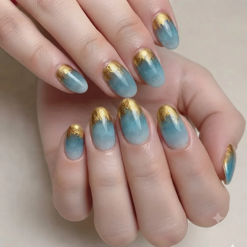
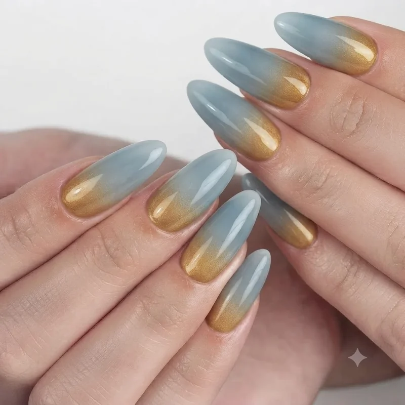
Yellowstone nails pull directly from the park's thermal features: warm geyser gold at the base, cooling into a steamy, mineral blue toward the tip. The look reads as an ombré rather than a gradient of random colours, because that is exactly what Yellowstone's own hot springs do in real life, gold at the shallow, cooler edges shifting into that famous saturated blue at depth. It is one of the few nail looks that is actually copying something real.
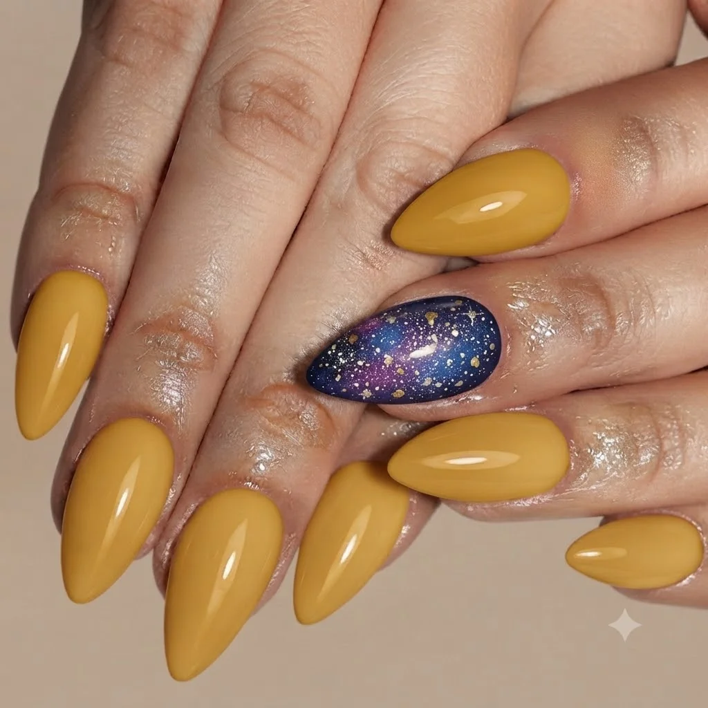
The gold in this palette is not the metallic gold you would use for a holiday manicure. It leans warmer and more mineral, closer to the ochre ring around a hot spring than to anything you'd find in a gold-leaf kit. Pair it with a steamy, slightly desaturated blue rather than a bright turquoise. The two together should look like they came from the same photograph, not from two unrelated mood boards. If you are working from swatches rather than a photo, ask for a mustard-leaning gold and a blue with some grey mixed in, closer to the colour of rising steam than a clear summer sky.
A clean two-tone ombré across all ten nails works well for a first attempt, gold on the lower half of the nail, blue on the tip, blended where they meet. For something more editorial, try a single accent nail with both colours swirled together in a marbled effect, echoing the way steam curls off a hot spring at sunrise. Keep the other nine nails in a solid, deeper gold so the accent nail has room to stand out. A soft chrome top coat on just the accent nail adds the faint shimmer of steam without tipping into full glitter territory. Of all the looks in this guide, this is one that reads instantly as a specific place rather than a generic manicure, since Yellowstone's colours are so distinctive on their own.
Grand Teton Nails: Alpine Blue Meets Golden Hour
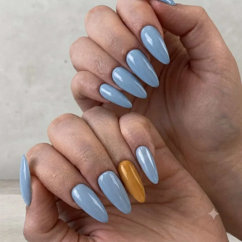
Most people assume a mountain-range manicure has to be all cool tones, grey peaks, blue shadows, done. Grand Teton nails work because they refuse that assumption. The Tetons at golden hour are cold, jagged alpine blue up top and warm, almost amber light pooling in the valley below, and the best version of this manicure holds both temperatures at once instead of picking a side.
Start with a crisp alpine blue as your base, cooler and slightly more grey than a typical sky blue, closer to the colour of shadowed snow. Then bring in warmth through either a golden-hour accent nail (a warm amber-gold, softly blended at the cuticle to suggest low sun) or a fine gold line detail running along one edge of each nail, like light catching a ridge line. The contrast is the entire point. Too much blue and it reads as generic winter nails. Too much gold and you lose the alpine identity completely.
This is also a strong pick for anyone whose trip includes Jackson Hole alongside the park itself, since the golden hour element pulls double duty as a nod to the town's warm, western light without needing a second, separate look. If you want the broader peak silhouette without the two-tone treatment, mountain-inspired nail designs cover that ground on their own, though the identity here stays tied to one named park rather than mountains in general.
Zion Nails: Red Rock and Desert Sunset Tones
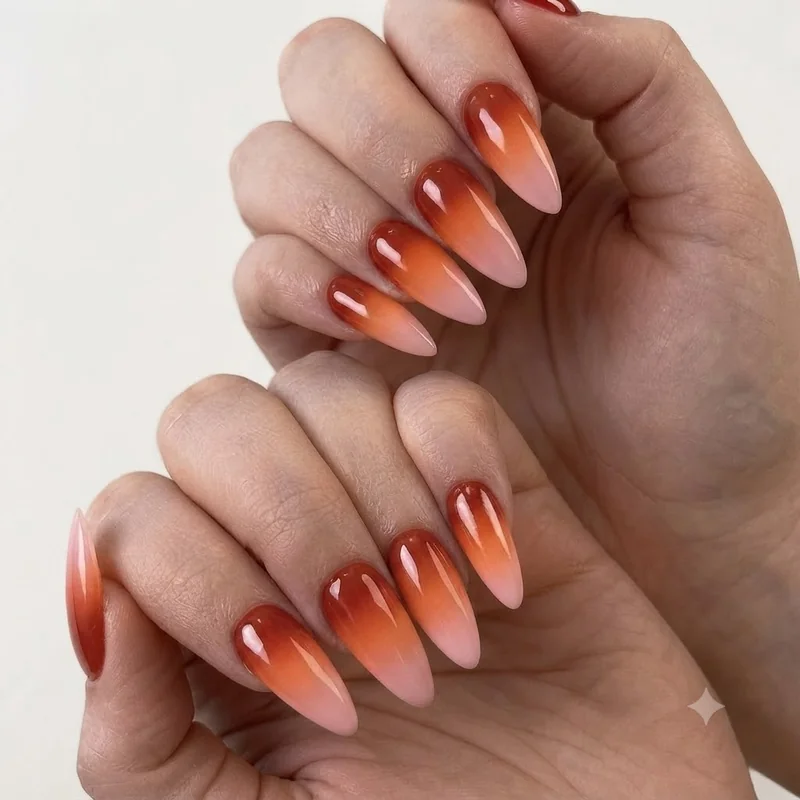
Zion's colours for a manicure are built from the canyon's own sandstone, a terracotta and vermilion base that shifts into deep sunset orange, sometimes fading up toward a soft rose where the rock catches the last light of day. This is one of the most recognisable national park nails looks in the whole set, since the palette is unmistakably tied to one specific place. This palette comes straight from the Navajo sandstone itself, coloured by iron oxide into everything from salmon to deep red-brown, so the manicure is less an interpretation and more a direct match to something you'll be standing in front of for photos.
The rock here is not one flat red. It shifts from a warm terracotta at midday into a much deeper vermilion at sunset, occasionally striped with darker desert varnish where mineral-stained water has run down the cliff face over centuries. A single-colour terracotta manicure captures the daytime version. A sunset-gradient version, terracotta at the base fading into a rich burnt orange, then a whisper of rose at the tip, captures the version everyone actually photographs, especially against the canyon at golden hour when the whole rock face seems to shift colour in front of you.
For something with more texture, a fine-line "canyon stripe" detail on an accent nail nods to desert varnish without literally painting a rock face onto your hand, a thin, slightly irregular vertical line in a darker brown-red running down one nail, the rest left in a clean terracotta. It is subtle enough to still read as a manicure first and a landscape reference second, which is exactly the balance this whole post is chasing, and it is what separates a genuinely wearable look from something closer to a costume.
Yosemite Nails: Granite Grey and Forest Green
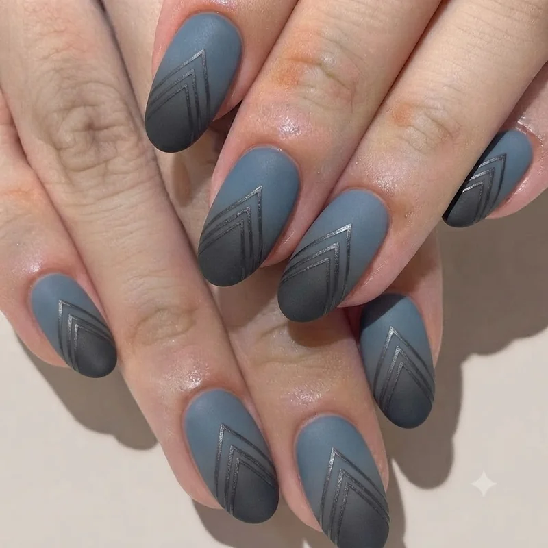
Somewhere between "too plain" and "trying too hard" sits the actual colour of Yosemite, and most nail interpretations miss it entirely by defaulting to either flat grey or cartoonish pine green. Yosemite nails work best as a granite grey base, cool and slightly warmed with a hint of beige rather than a stark, cold grey, paired with a deep, almost blackened forest green for contrast or accent.
Granite is not uniform. It carries flecks of quartz, mica, and feldspar that catch light unevenly, so a granite-inspired base benefits from a subtle shimmer finish rather than a flat matte grey, something that suggests texture without turning into full glitter. The forest green half of this pairing should run darker and cooler than a typical "sage" or "olive" nail trend colour. Think the shadowed underside of a sequoia canopy, not a Pinterest-board sage green, since Yosemite's forest reads far darker and denser in person than most "forest green" polish names suggest.
A solid grey base with two green accent nails is the most wearable version of this look and reads as sophisticated rather than costume-y, avoiding the exact trap this reader is most worried about: a literal bear-and-pinecone design that tips into try-hard territory. For a more editorial take, a fine white line detail across one nail can suggest a granite dome's ridgeline against a green sky, without needing any literal imagery at all. Restrained national park nails like this one tend to age better in photos than anything too literal.