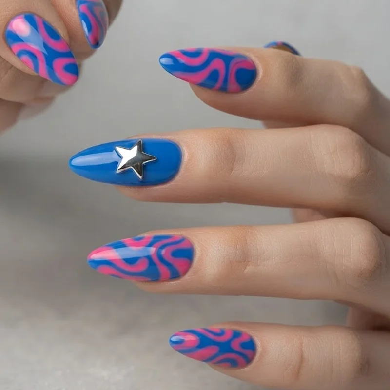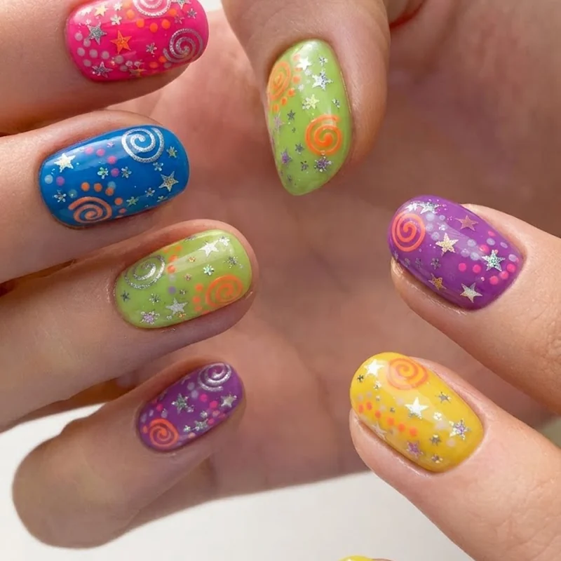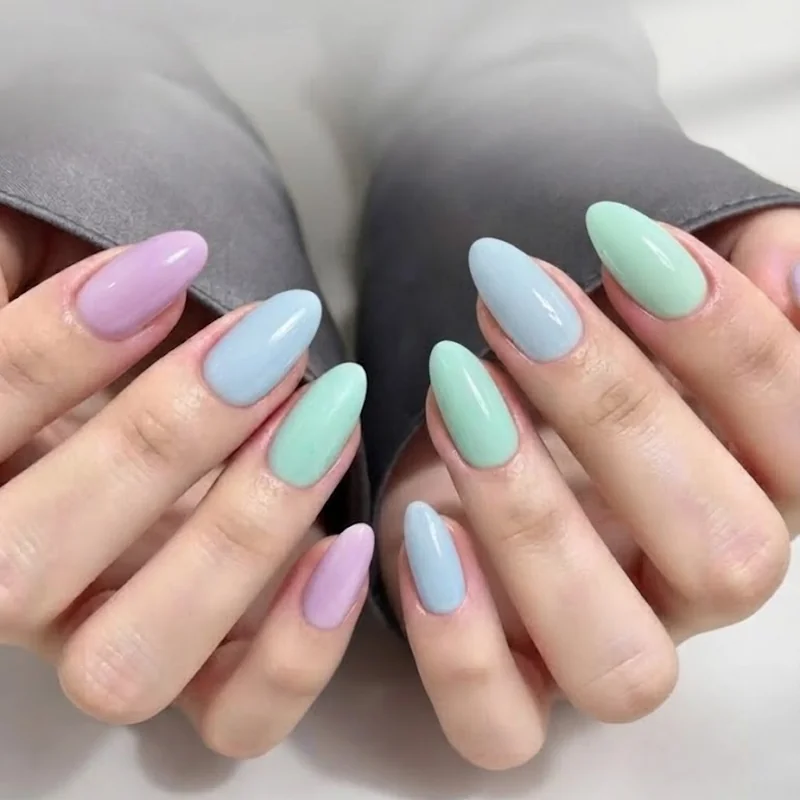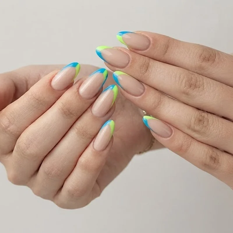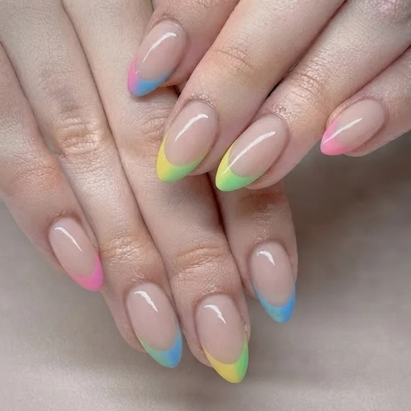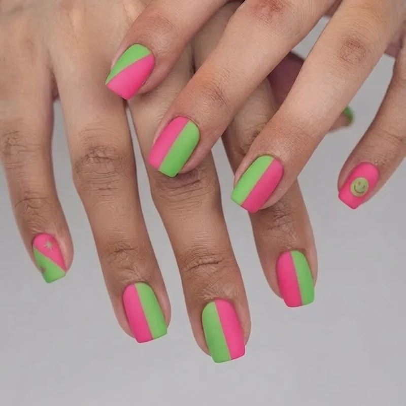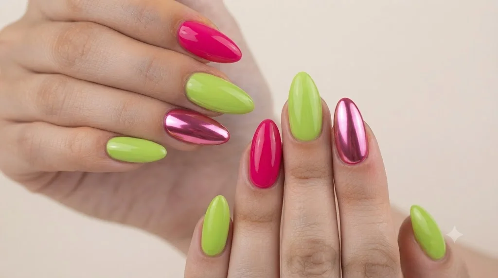
Colorful y2k nails means hot pink next to lime green, blue layered against candy pink, or five different shades split across ten fingers, not the chrome and silver sets that most "Y2K nails" content treats as the whole trend. The chrome look is one branch of Y2K. The loud, saturated, more-is-more branch is the one this era actually got its reputation for, and it's the one most roundups skip past on their way to another metallic French tip. This is the corrective: the full color range, organized by which pairings actually hold together and which ones just look chaotic. Colorful y2k nails reward a little pairing logic, and once you see the combos that repeat across the era's real cultural references, from Bratz packaging to Juicy Couture tags, the "does this clash" anxiety mostly disappears.
That's the promise here: 35 ideas, sorted by color story instead of by motif, so you can find your palette instead of scrolling past twenty chrome sets to reach the one that's actually yours.
What Makes a Y2K Manicure "Colorful" (And Why Chrome Isn't the Whole Story)
Colorful Y2K nail art uses saturated, non-neutral shades as the main event, not an accent. Think hot pink, lime green, cobalt, orange, and grape purple applied in blocks, skittle sets, or French tips, often two or more colors per hand. This is different from the chrome, silver, or frosted-metallic looks that dominate most "Y2K nails" search results, which lean on finish and shine rather than pigment.
Chrome powder is a metallic pigment applied over a base color to create a mirror-like or satin-metal finish. It's genuinely a Y2K signature, showing up on everything from butterfly clips to flip phone cases, but it's a finish, not a palette. A chrome-topped nude nail and a hot pink and green skittle set both count as "Y2K," yet they read as almost opposite aesthetics. Most competitor content flattens that distinction, defaulting to silver and pink chrome as visual shorthand for the entire trend and burying everyone who actually wants the loud stuff. If you want the full breakdown of every Y2K nail sub-style, from chrome to charms, that's the wider map. This post stays on one road: color.
What earns a set the "colorful" label here is saturation and multiplicity. A single soft pink is Y2K-adjacent at best. Two or more high-saturation colors, deliberately paired, is the real thing. The era's actual reference points back this up: Bratz dolls in magenta and turquoise, Lisa Frank's rainbow-on-rainbow prints, the primary-and-neon palette of early iPod minis. None of those touchstones were subtle, and neither should this side of the manicure be.
Hot Pink & Green: The Most Y2K Combo There Is
Hot pink and green is the single most iconic Y2K nail color combo, full stop. It's the pairing behind Bratz doll packaging, early McDonald's Happy Meal toy branding, and half the flip phone cases that defined 2003. If you're only going to commit to one colorful pairing, this is the one that reads as unmistakably Y2K on sight.
The reason it works isn't an accident of nostalgia. Hot pink and green sit almost opposite each other on the color wheel, which means they contrast hard instead of blending into each other, exactly the effect a maximalist manicure wants. Lime or grass green next to a true magenta-pink, not a muted sage, keeps the combo from drifting into something softer and more "garden party" than "mall rat 2003."
This pairing is the one to start with if you're only trying one pairing from the whole colorful y2k nails range. The most common execution splits the two colors across the hand rather than mixing them on a single nail. Four fingers in hot pink, thumb and index in green, or a full alternating pattern, both read cleanly. Add a chunky floral or a graphic swirl in the opposite color on one or two accent nails, and the set stops being a simple two-tone job and starts feeling art-directed. Almond and square shapes hold this combo especially well since the wider nail bed gives the color block room to actually register instead of getting cramped.
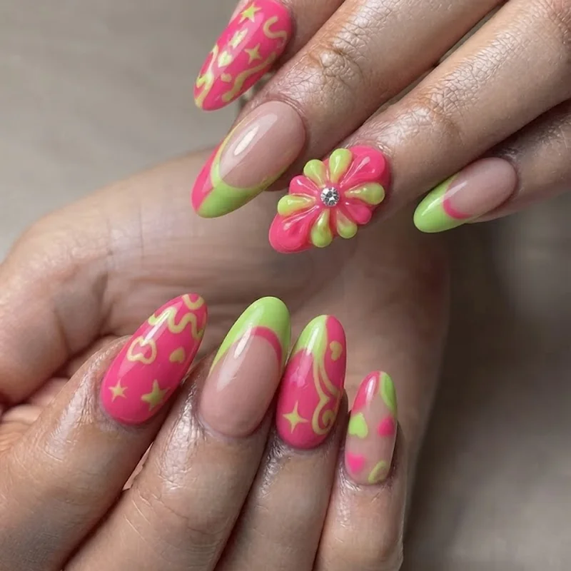
Where people get nervous is intensity. This combo doesn't have a quiet version, not really. A pastel pink and sage green attempt at the same idea loses the specific cultural reference entirely and just becomes generic spring nails. If the full-saturation version feels like too much for daily life, keep it to two accent nails against a neutral base rather than diluting the colors themselves. The combo needs the contrast to work. Soften the coverage, not the shades.